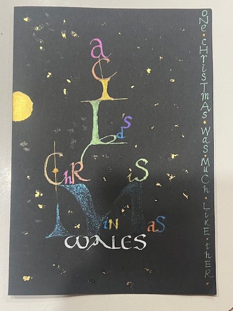
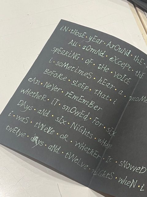
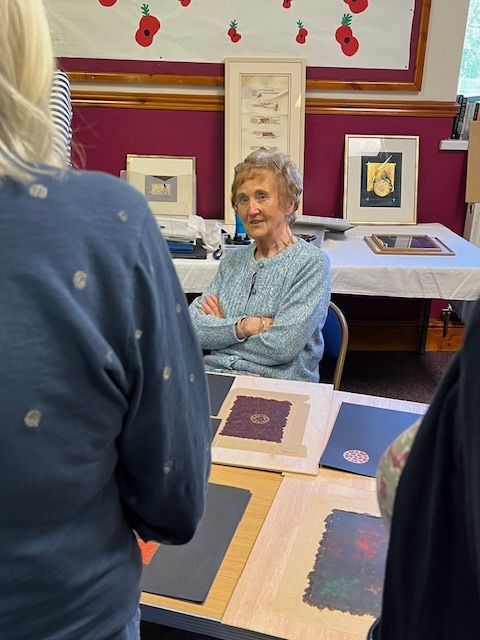
Workshops
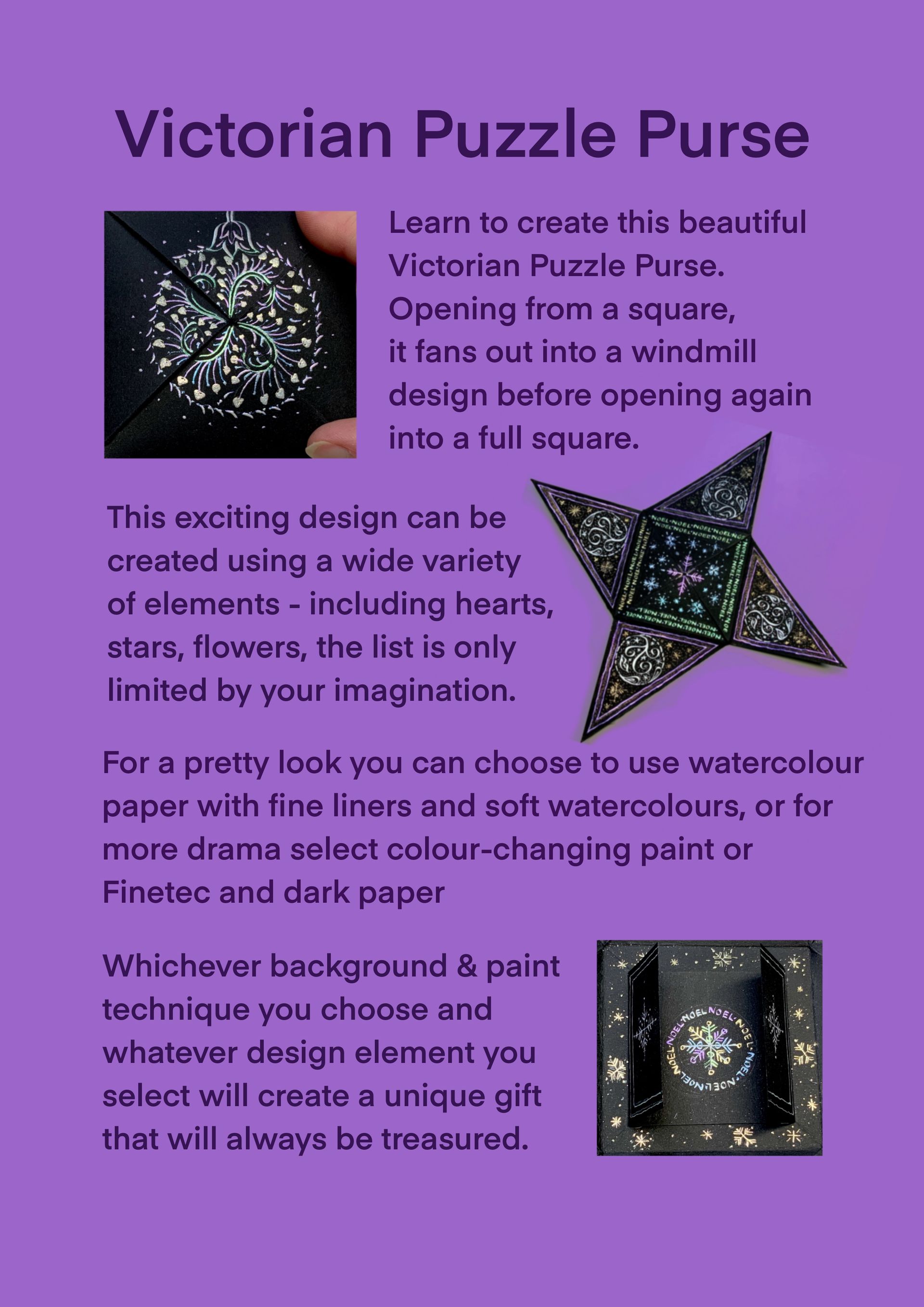
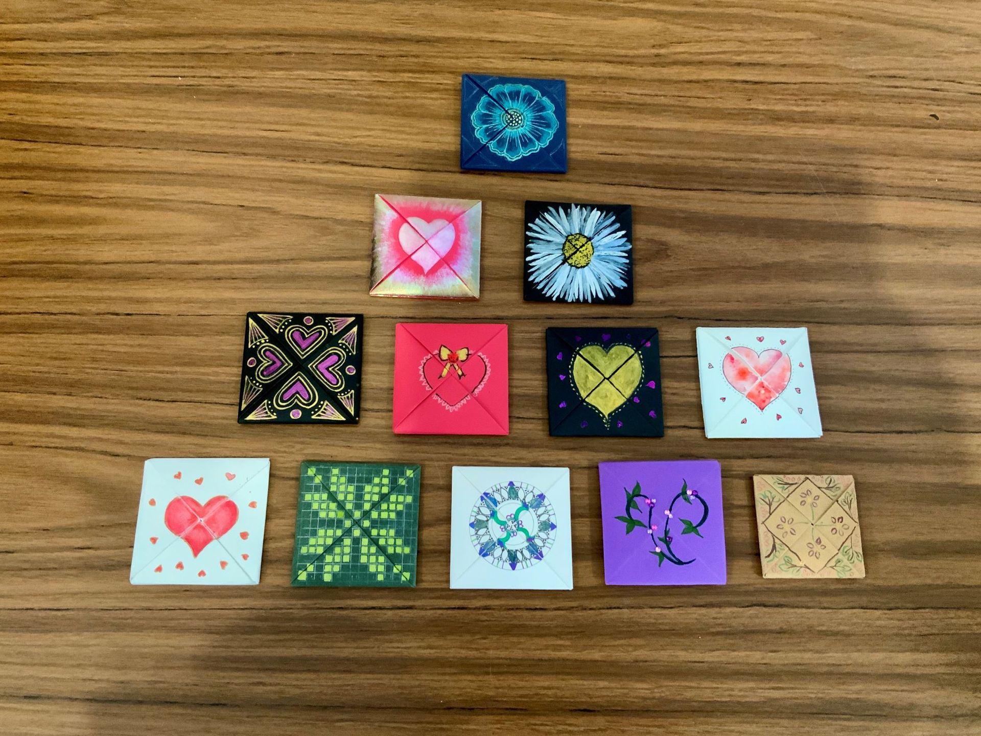
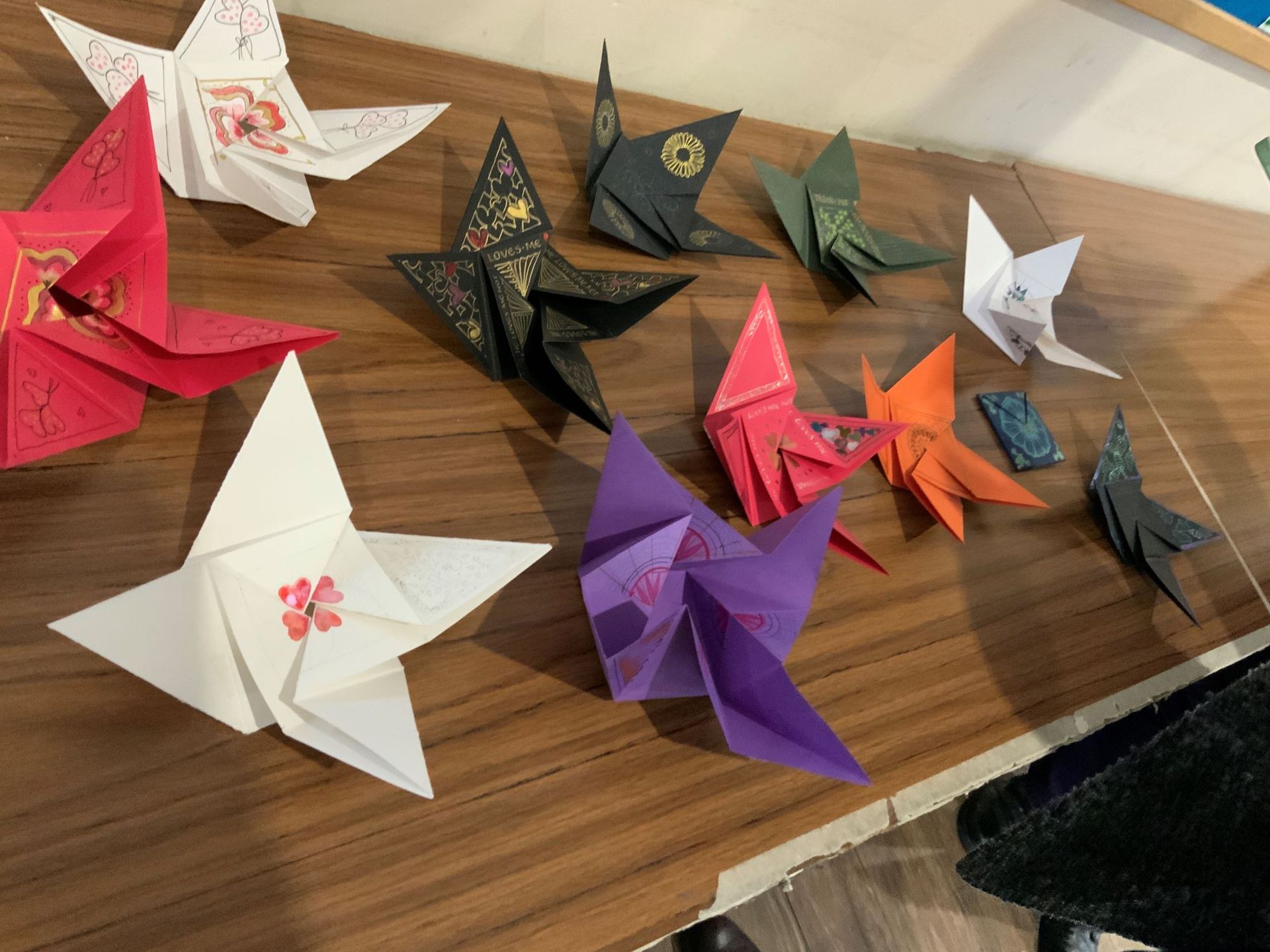
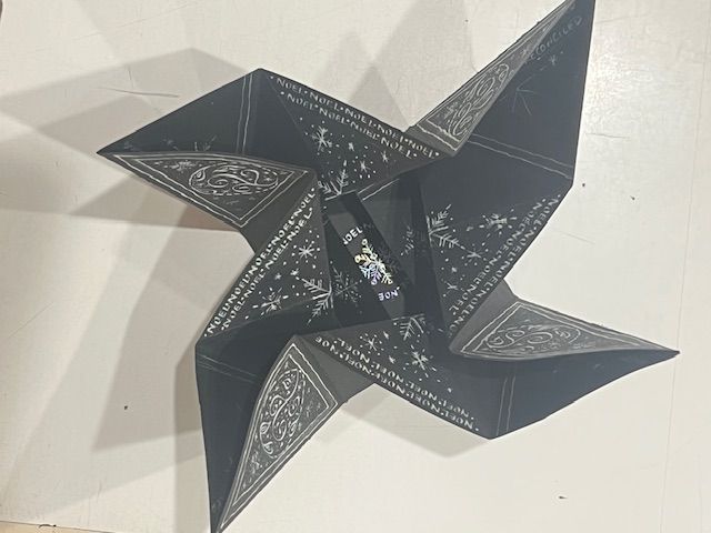
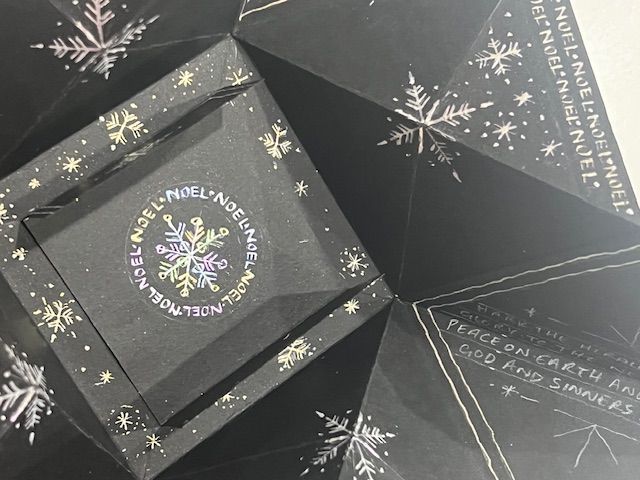
Victorian Puzzle Purses
14 | 02 | 2026
Member-led Workshop with Judith Porch
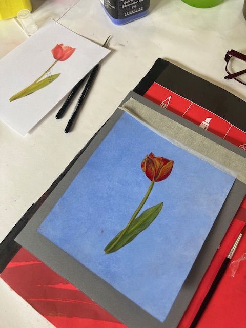
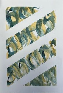
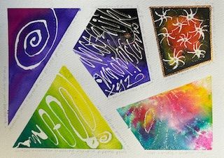
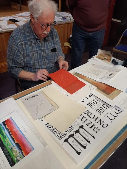
'We had a fabulous day making Victorian Puzzle Purses, I just don’t know where the time went!' says Grace after another successful 'Member-led Workshop' last Saturday.
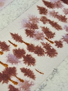
Judith had brought a festive Victorian Puzzle Purse to our Christmas get together and we all felt it would make a brilliant full day workshop with a 'Spring unfolding' theme.
It certainly was something different and a chance to learn new skills and be creative.
Grace continued saying 'I’d never thought about using an embossing tool to create neat dots until Judith mentioned it yesterday. There was also a lot of discussion about the suitability of paper types and sizes. It was a great chance to try out all our different paints and pens and let our design ideas go wild.'
I think everybody from the more experienced to the beginners enjoyed the variety of activities and just having chance to 'chat calligraphy' throughout the day.
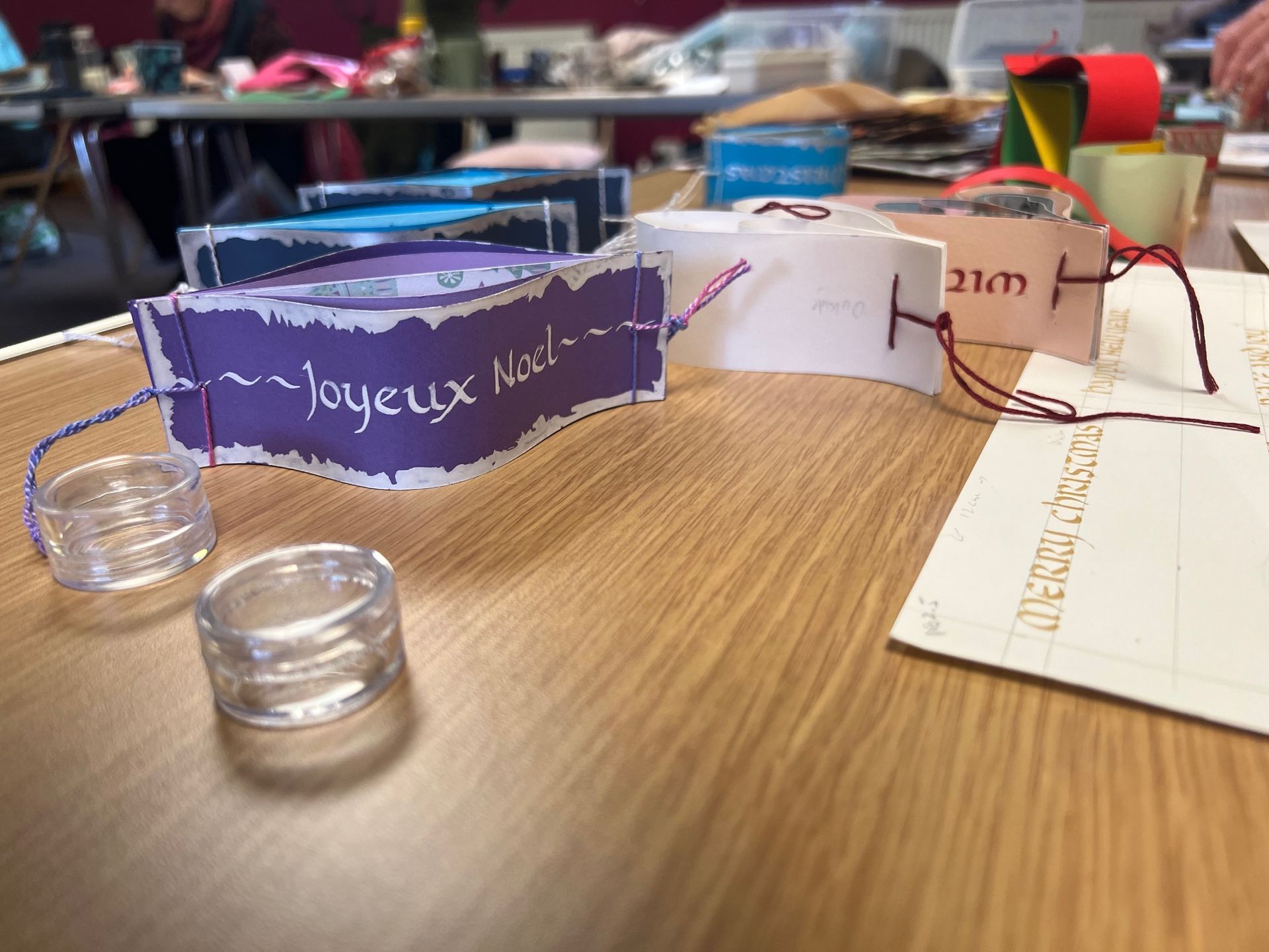
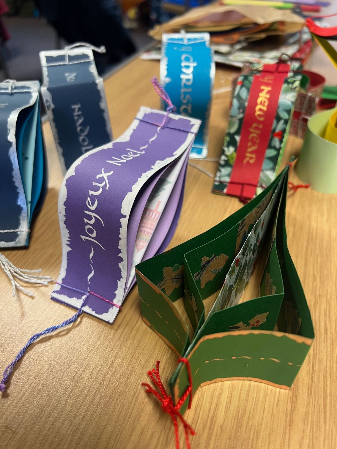
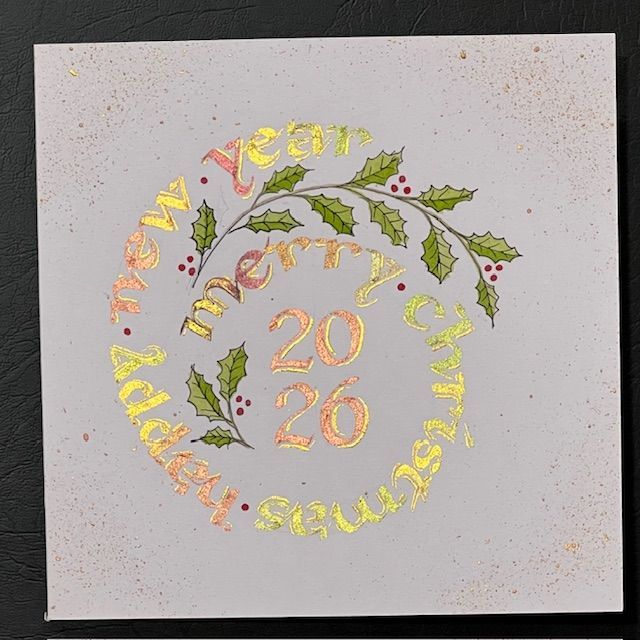
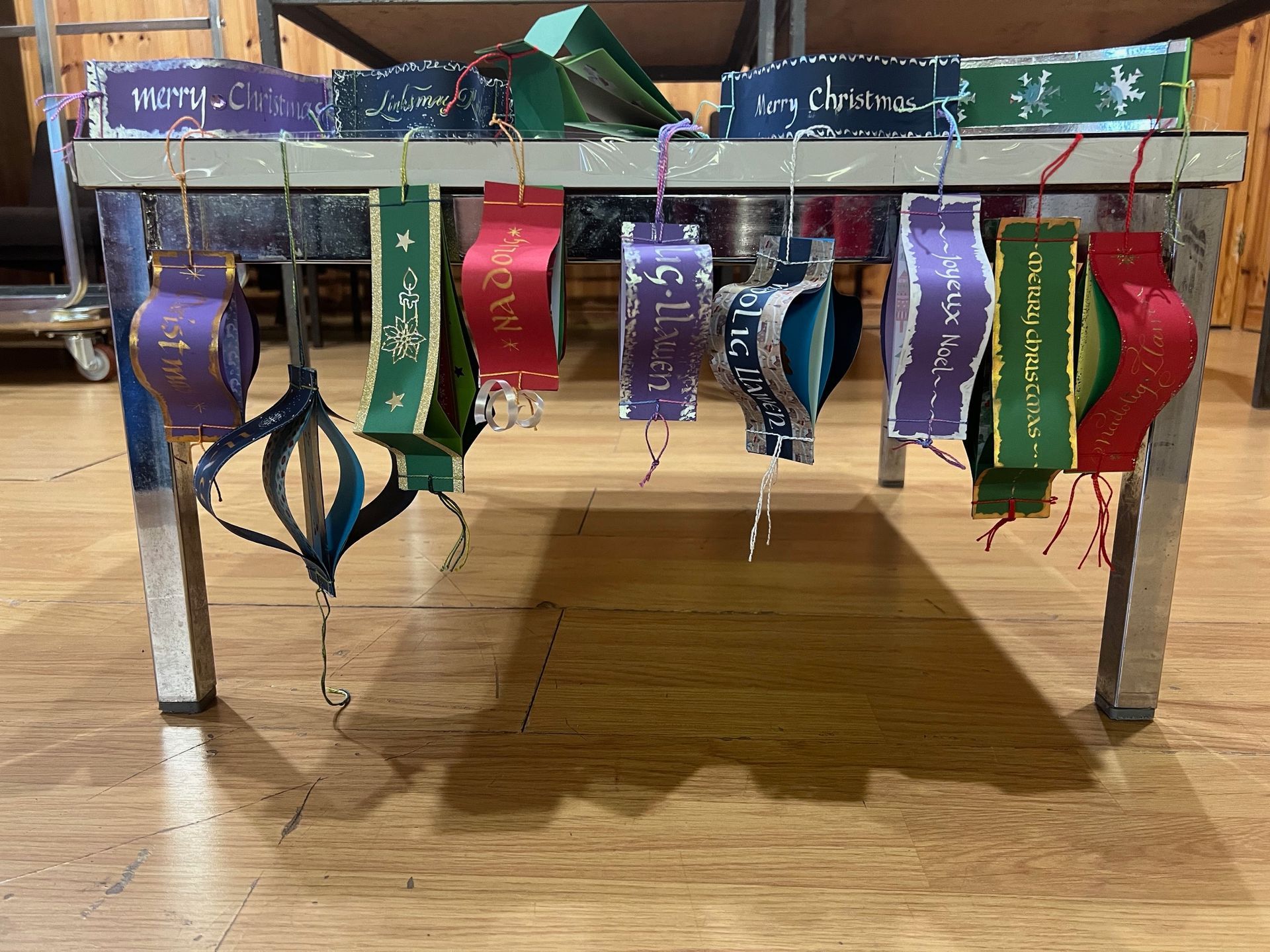
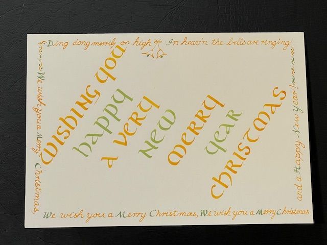
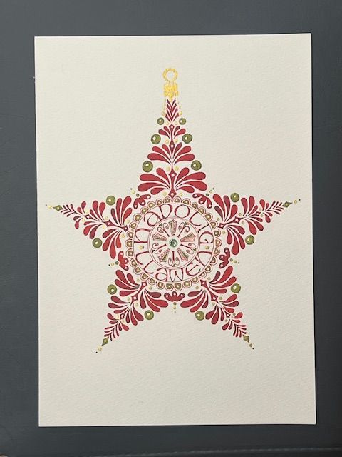
AGM & Christmas workshop
22 | 11 | 2025
with Alison Allan
We had such a fun festive day!
After the business of the AGM was concluded in the morning, SWS member and secretary Alison led us in our afternoon activity making these beautiful calligraphic Christmas decorations.
We also held our first 'Gordon Wood Award - Christmas Card Competition'. The beginner's section (under 4 years of study) was won by Elise Jenkins, with the more experienced section winner being Ann Sear. Congratulations to both winners who received a Scribblers Gift Token.
18 10 2025
Bouncy Foundation Hand
with Mary Noble
Reviewed by Grace Birt, Alison Allan and Lesley Romano
It was lovely to welcome back Mary Noble for this varied and challenging day.
There was something for everyone in this workshop; from the beginners able to benefit from the wealth of experience and advice on offer from Mary in developing their basic Foundational hand, to the more experienced grappling with making effective use of ‘contrast’ as a layout design device.
Mary made the Bouncy Foundation look deceptively easy when she produced individual place-names for all 18 participants on the spot ... when in fact it was quite a challenge for the rest of us!
Our day was made up of four main activities:
Activity One: We began our work by writing the alphabet in 'foundation hand' and focusing on our best letter 'o'. The proportions of this letter would help keep our letters regular.
Activity Two: This was where we began to 'bounce' our letters, with a pencil or ‘biro’ at first. We tried not to take our pens off the paper and ensured we kept a 'high symmetrical arch' ... unlike the low sprung asymmetric italic arch.
Activity Three: We progressed from a pencil or biro, via ruling pens and monoline Speedball ‘B’ series nibs, through to broad edge nibs. We worked our way up through the nib sizes to the very broad ‘automatic’ type pens. The more experienced amongst us tried pen manipulation, rolling the nib. Ensuring there was plenty of ink on the nib certainly made this easier.
Activity Four: Next we began designing a small ‘contrast’ piece to include thick and thin pen work. When we were happy with our layout, we were encouraged to add colour to the piece.
“A thoroughly enjoyable day learning about how to vary the formal Foundational hand to give it some spring and lightness, as well as seeing the effect of using different tools, like ruling pens and “blobby” script pens. And being reminded of the role of using contrast in script size and weight when designing a piece.” Alison
At the end of our workshop, it was lovely to see the different ideas and interpretations put on display. There was a lively discussion about our work, with Mary giving valuable and insightful feedback on each piece.
Throughout the day Mary was very generous with her advice and was thanked by us all for her expertise, hard work and encouragement. She certainly presented a more flexible Foundational and opened up a world of possibilities.
Thank you very much to Mary!

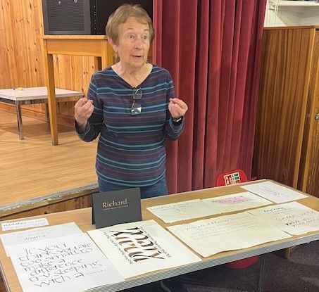
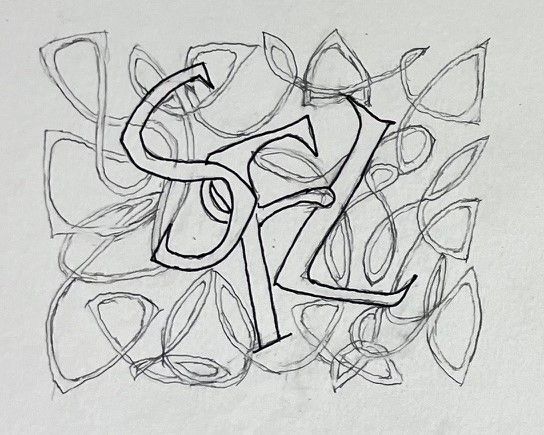
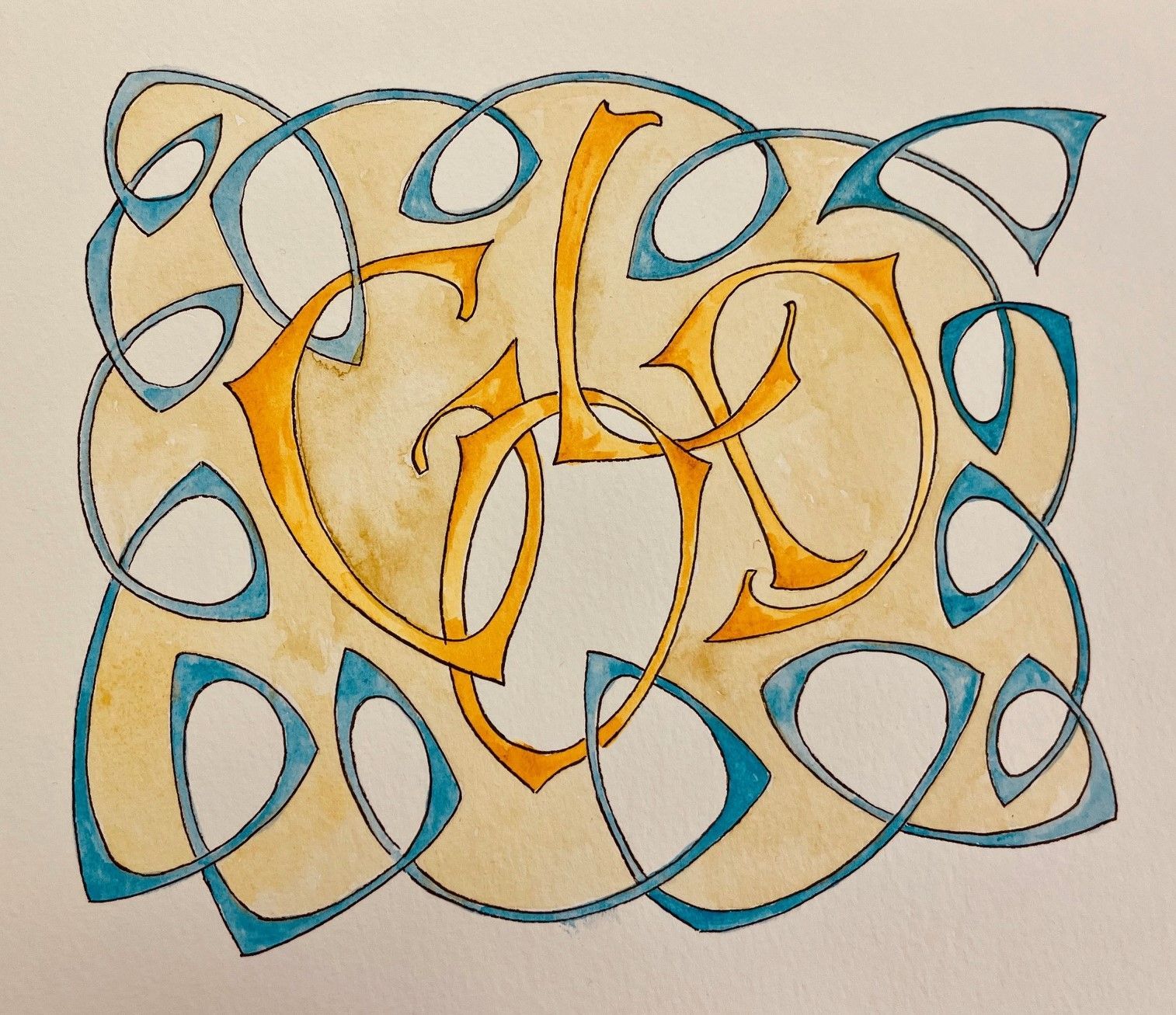
12 | 07 | 2025
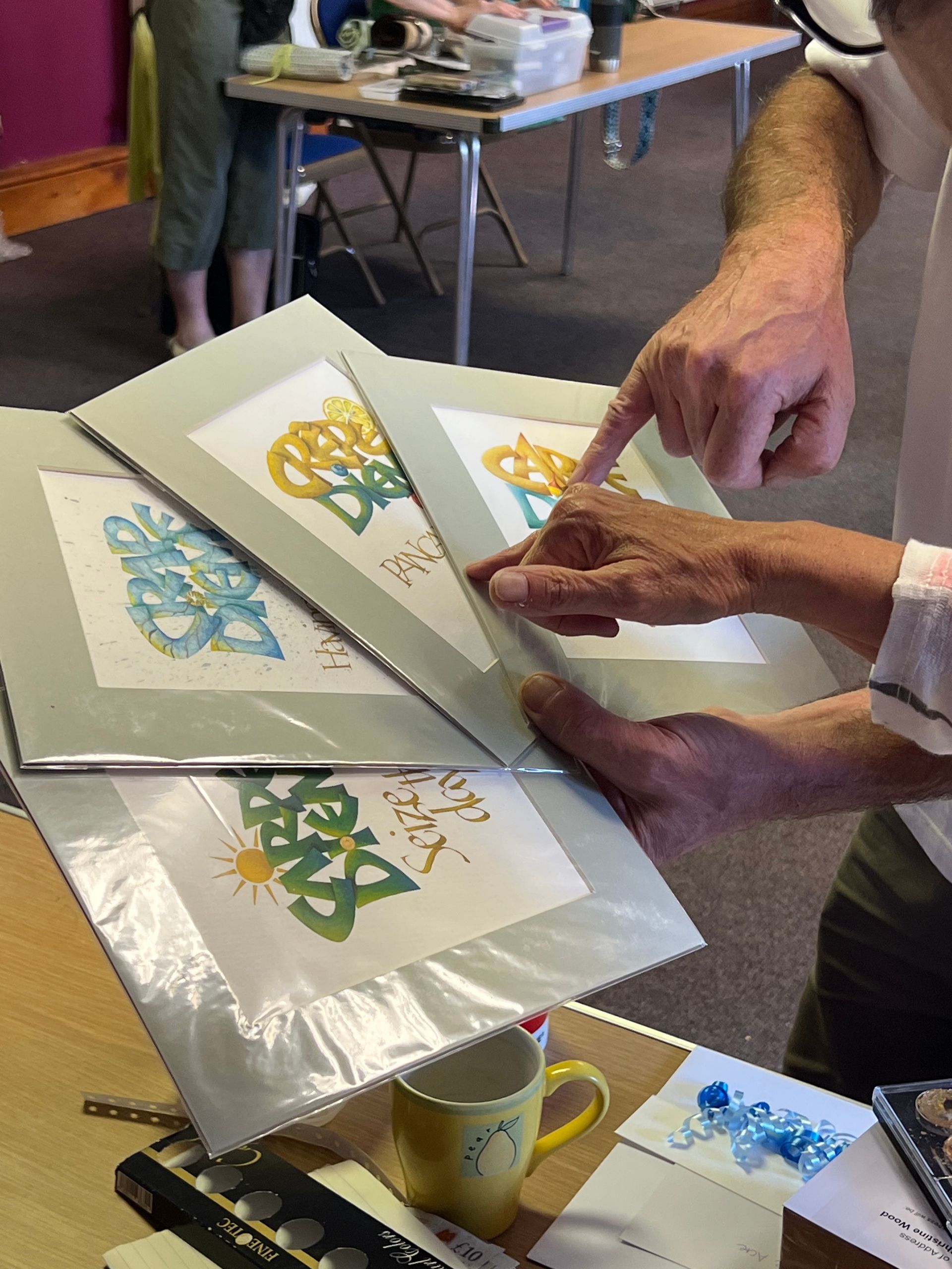
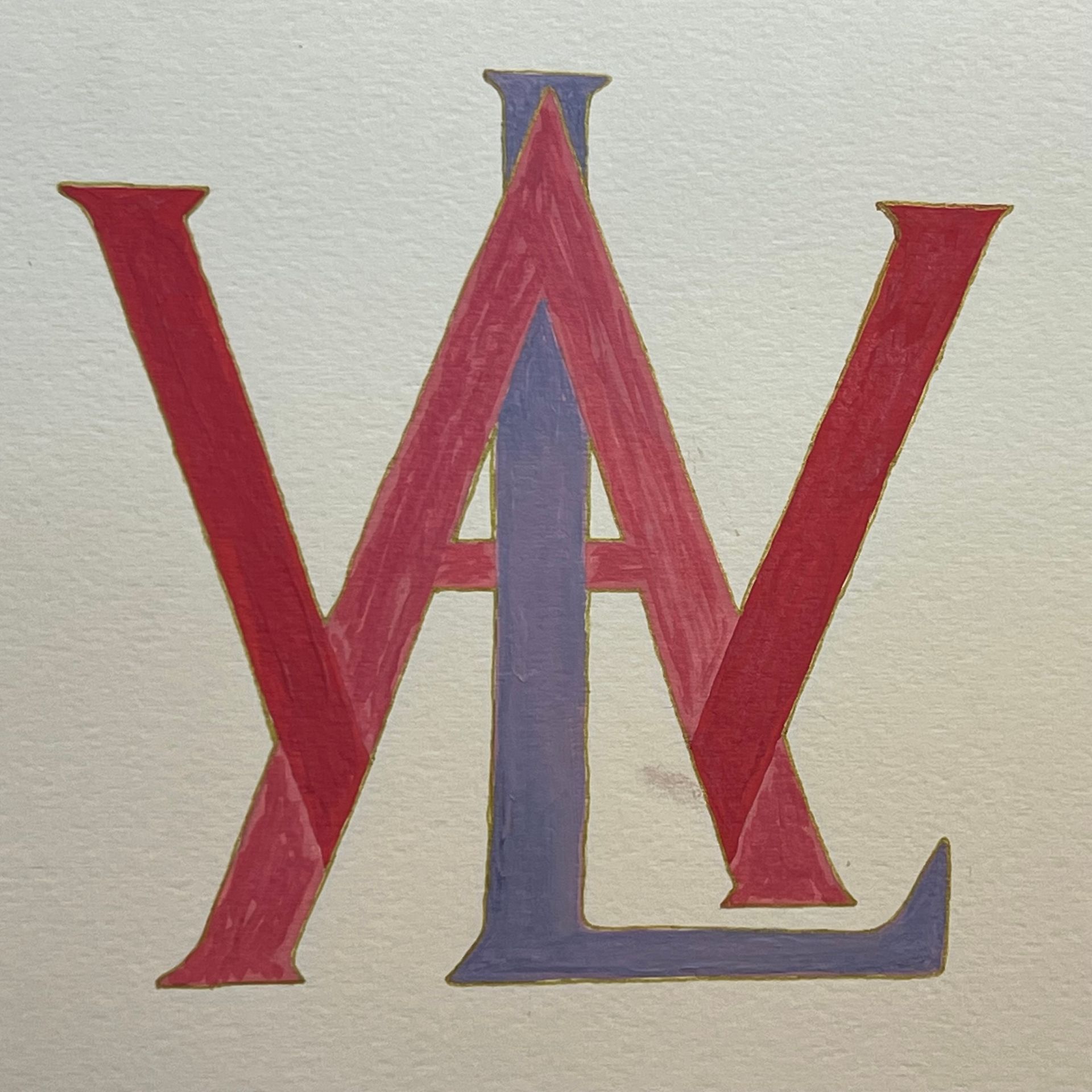
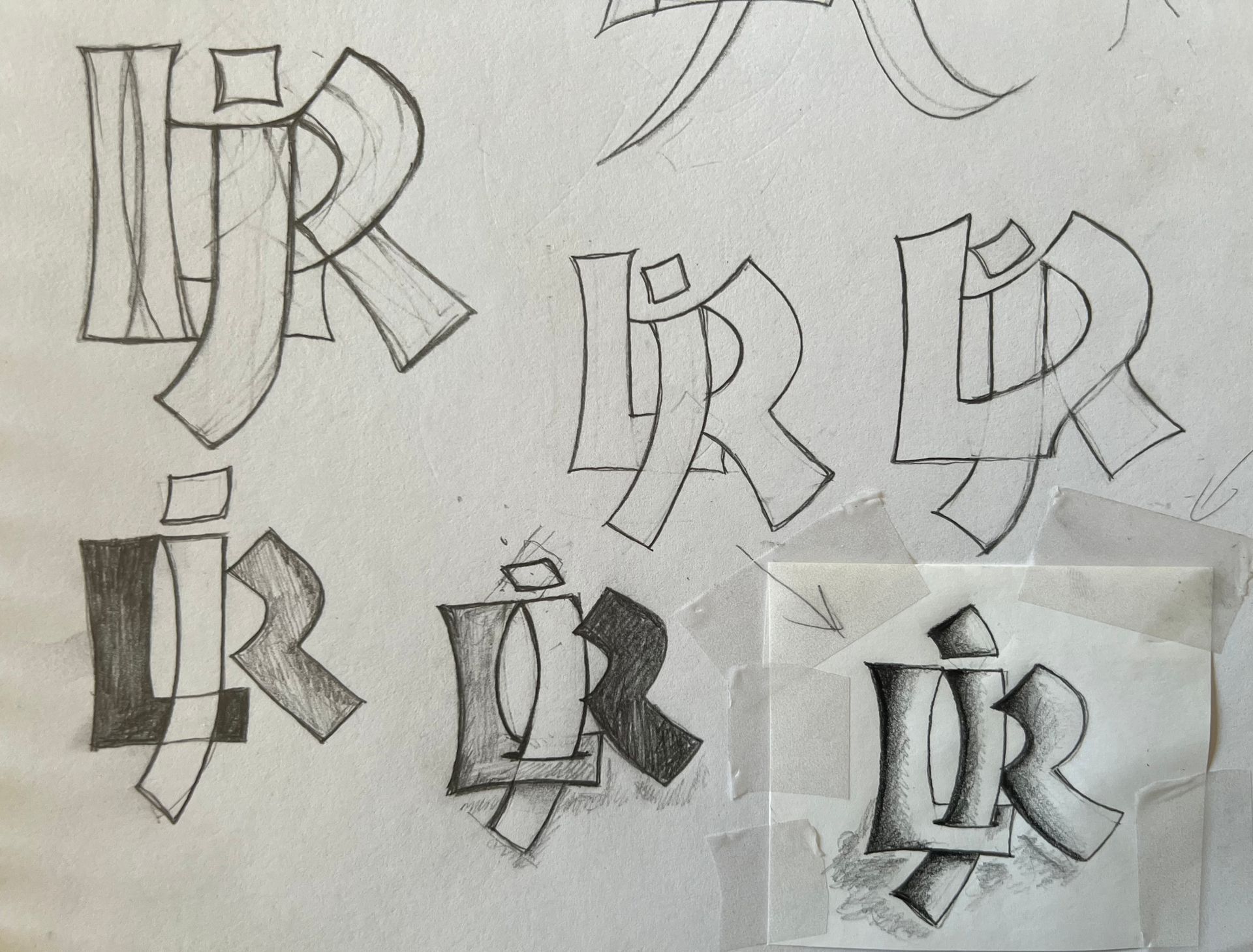
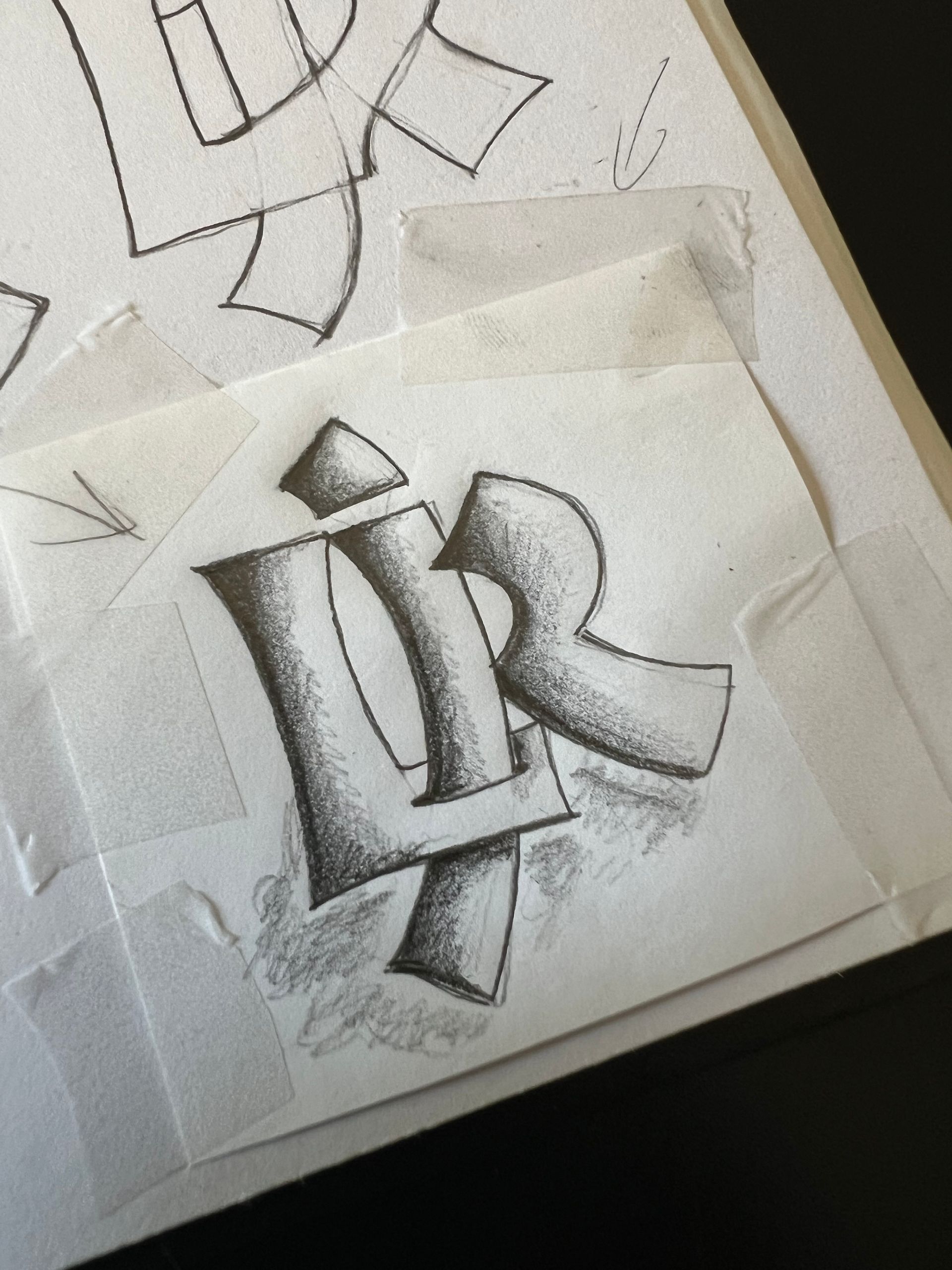
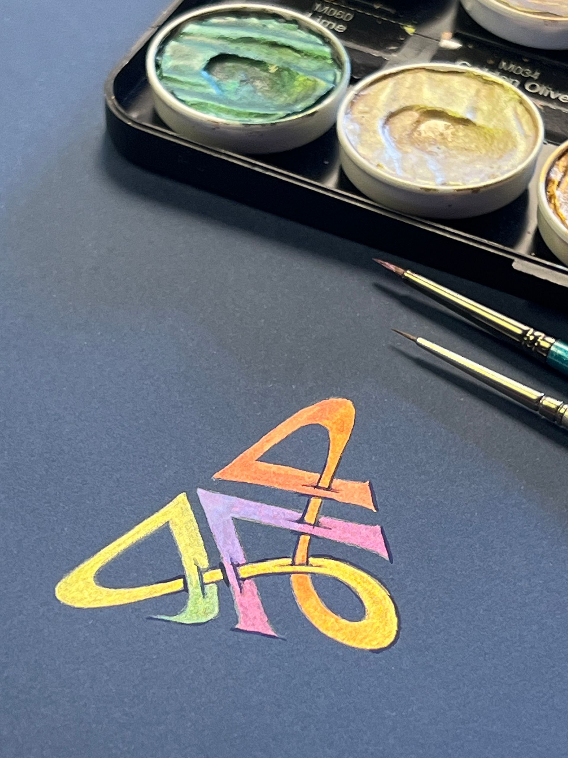
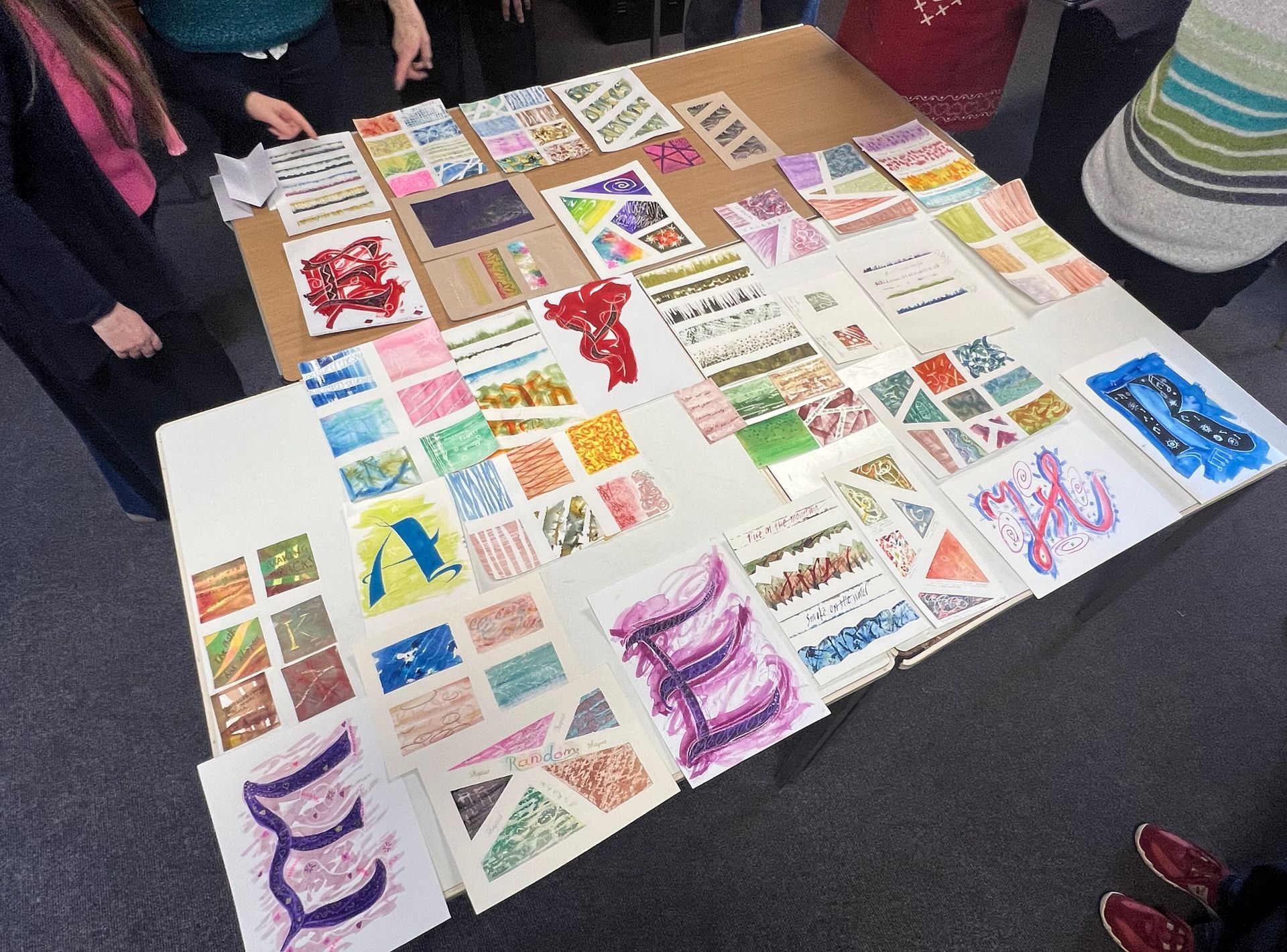
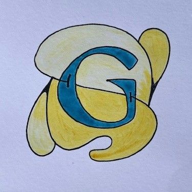
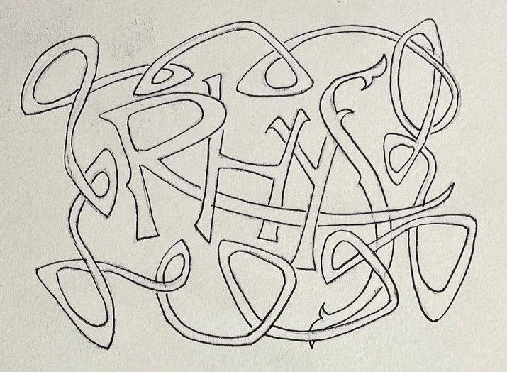
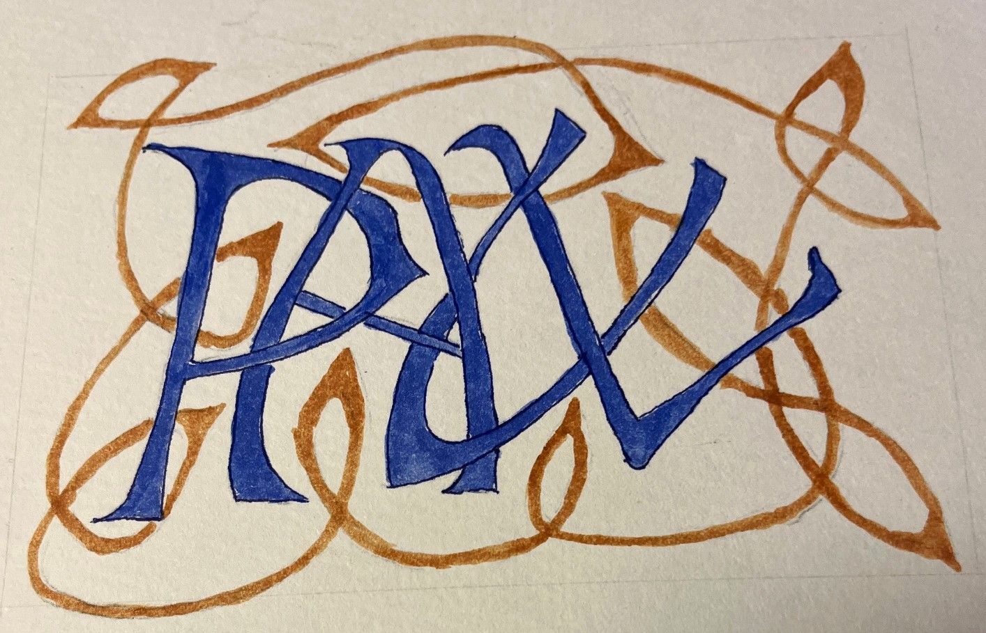
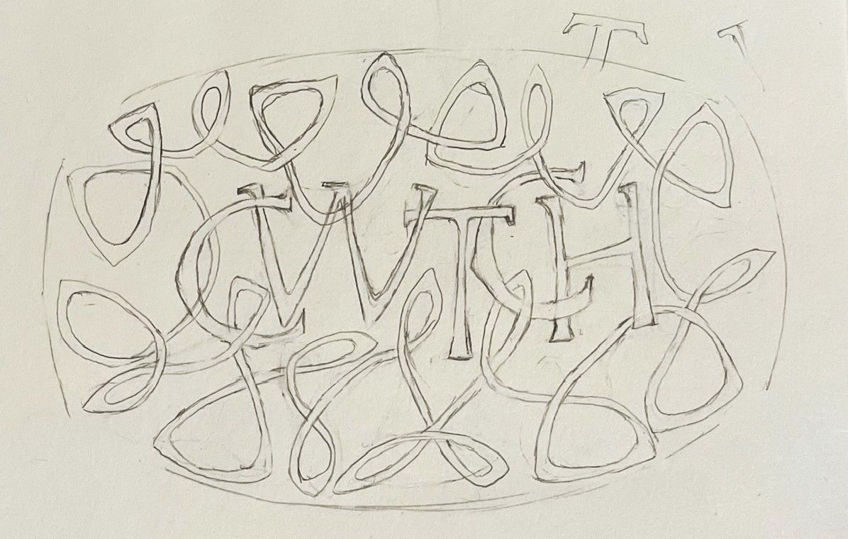
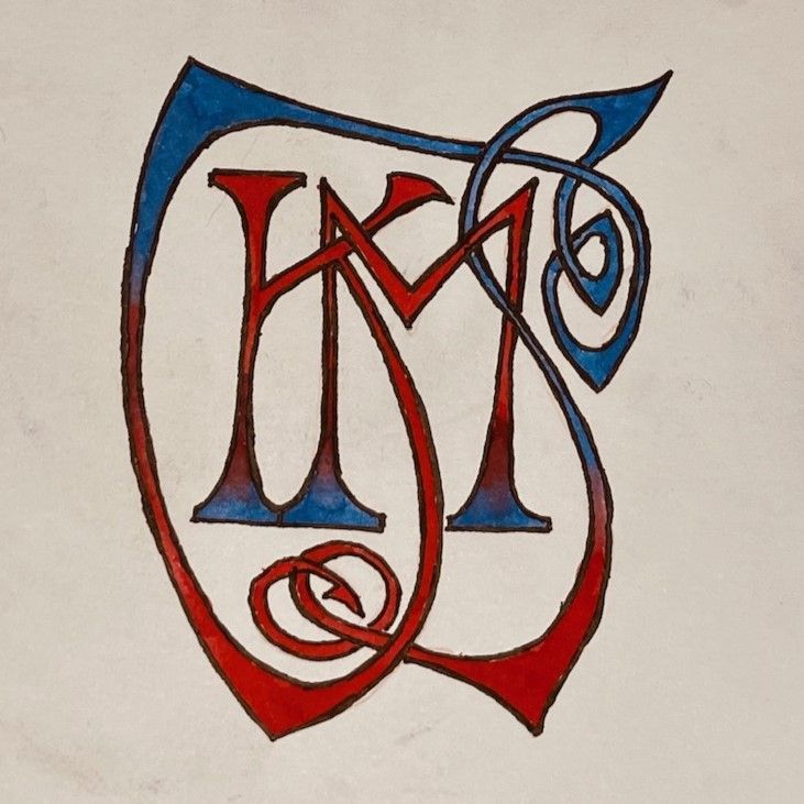
Monograms and Cyphers
with Peter Lloyd
South Wales Scribes were delighted to welcome back tutor Peter Lloyd after a very well received workshop on Saxon Scripts and Runes in April 2024.
Reviewed by Grace Birt, Val Carter and Doug Adams
Grace:
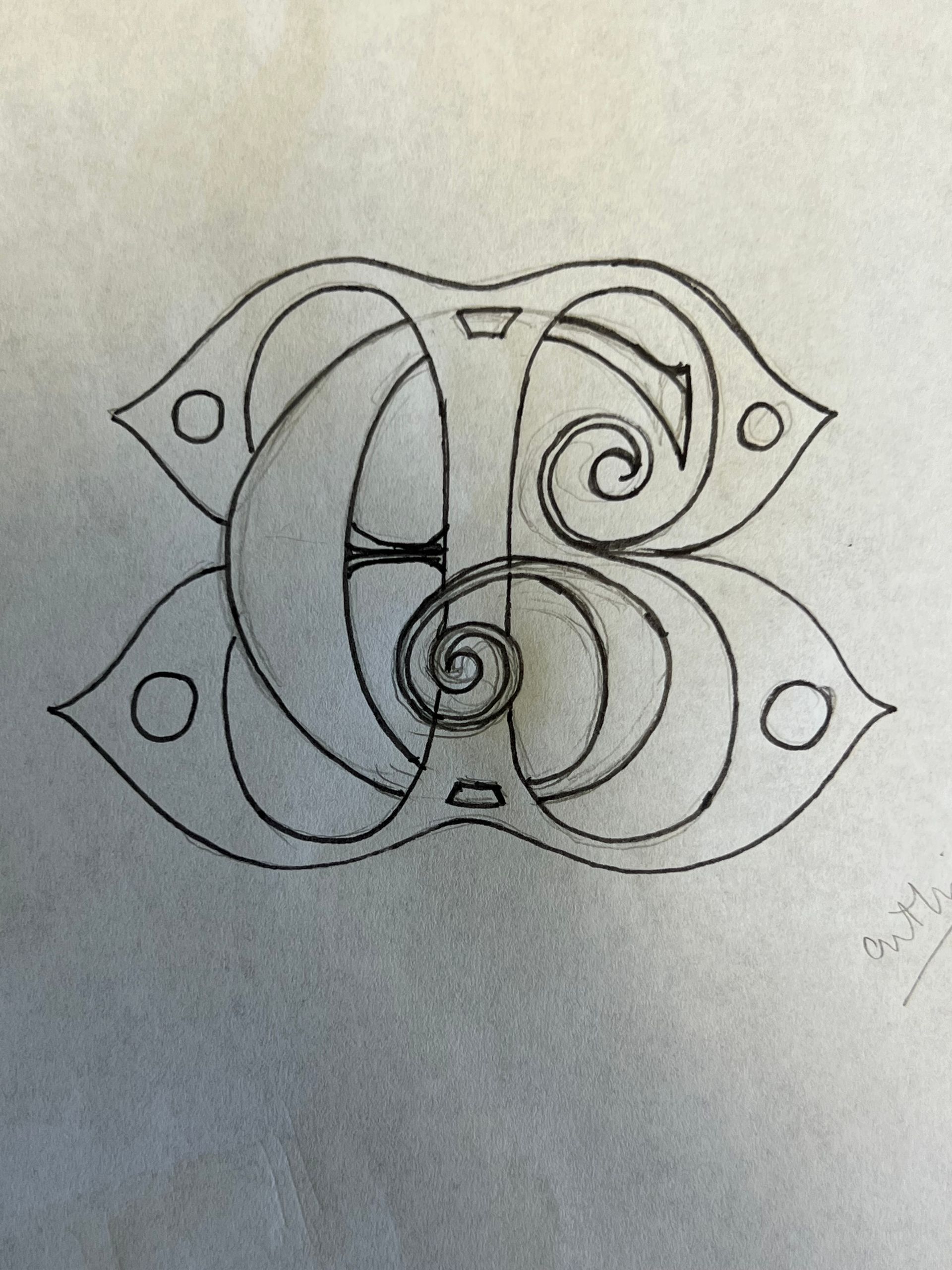
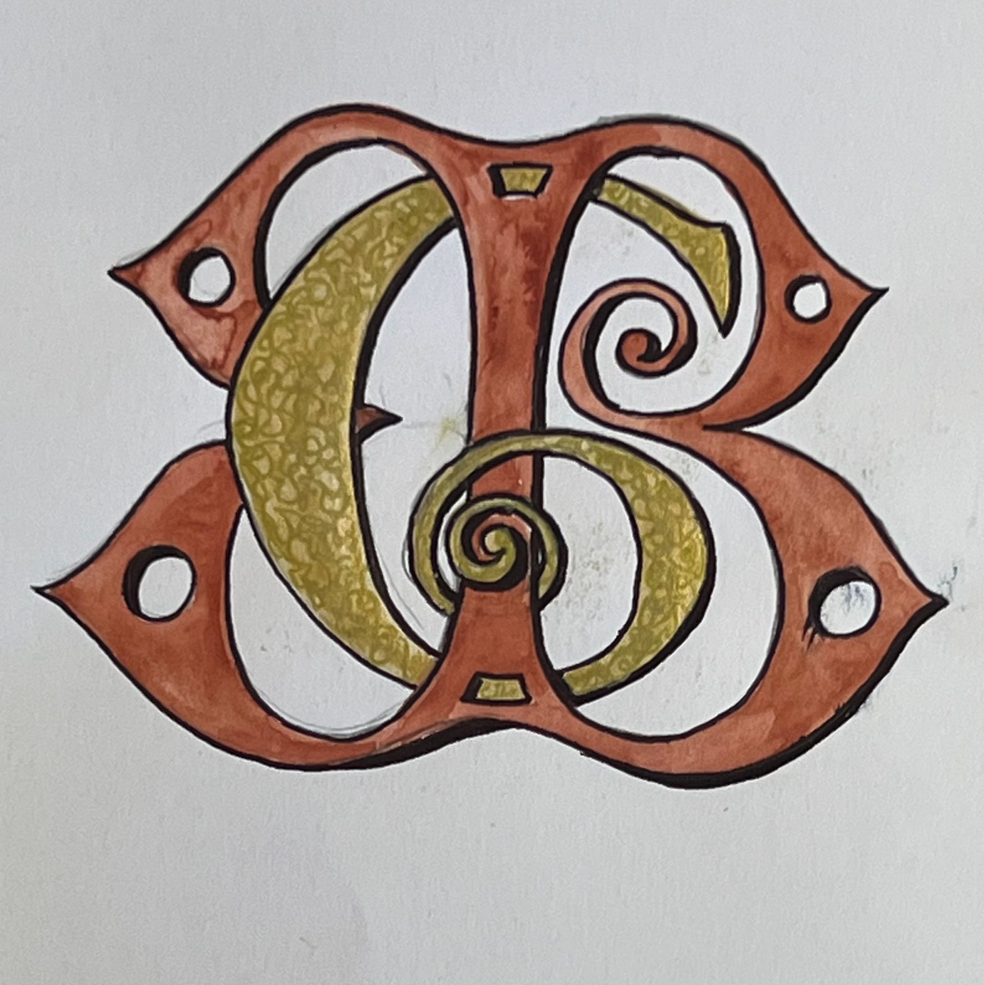
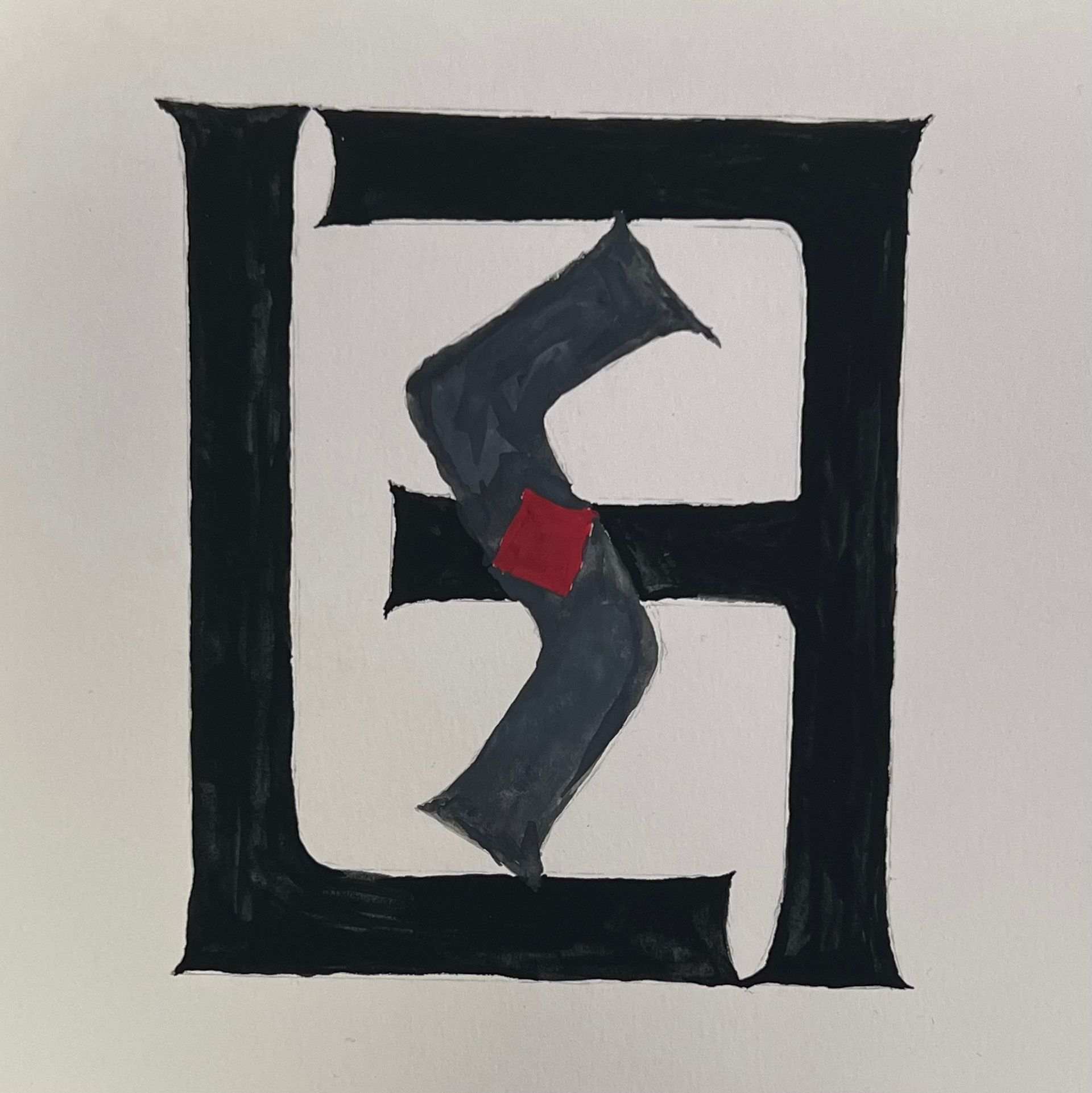
Peter began this workshop by clearing up the differences between initials, monograms, cyphers and logos … a topic that had puzzled me before. Next came our chance to experiment with our own initials using Roman capitals.
After demonstrations we were encouraged to include serifs, extend and interlink letters, use different style lettering, introduce a third letter, interchange upper and lower case letters, include symmetry as well as change in weight, size, shape and colour of our designs and ideas. The design process was certainly challenging but really interesting and I think we were all amazed how we eventually moved from something quite primitive to such complex images for the final piece.
Having worked through a process in such detail and with Peter's positive guidance, I feel more confident to produce more of these fascinating pieces. I think we all found this day extremely useful.
Val agreed and commented that ‘Peter's workshop on Monograms and Cyphers was a delight due to his enthusiasm for his subject and his skill at getting it across’ ... ‘He involved the whole group while discussing an individual's work’ in a supportive and encouraging manner. We learnt a great deal about the difference between, and the execution of, monograms and cyphers - He also gave each one of us a bookmark with a monogram or cypher of our initials.
Doug said that the Monogram and Cypher theme was a new subject that he’d ‘not really thought about before’.
He appreciated the interesting ideas from Peter as well as other members and liked the emphasis on 'thinking outside the box'. He plans to use some of the ideas for birthday cards.
The day concluded with an excellent ‘come together’ review which was appreciated by many attendees. Val summed it up by saying that ‘All in all it was a most enjoyable and instructive day.’
Thank you once again Peter!
26 | 04 | 2025
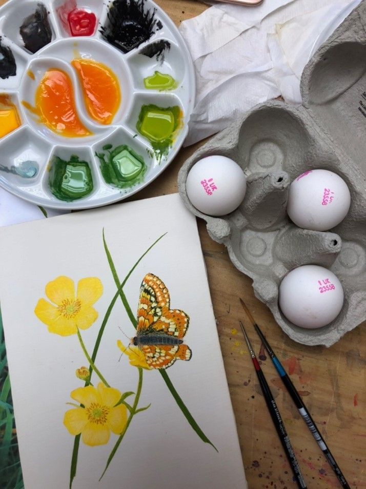
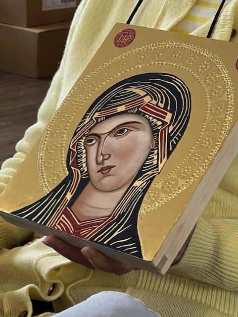
Egg Tempera Painting
with Alma Swan
Egg tempera, a paint composed of pigment bound by egg yolk, is an ancient painting medium which has been used for many centuries in India, Egypt and Europe. Egg tempera is very long-lasting and examples are still in existence date from the first century AD. Importantly for artists, egg tempera is a translucent, glowing medium which gives paintings a complex brilliance and luminosity that is not matched by any other medium
In this workshop Alma showed us how to make egg tempera paints from scratch and how to apply them in trials overlaying colours to demonstrate the translucency of the medium. Finally we created a small painting and in doing so we covered most of the techniques that can be used when painting with egg tempera.
We also made our own tracedown using layout paper and fine red clay (Armenian Bole) which gave a remarkably clean and clear transferred image.
SWS Member Grace: ‘Hearing about the history behind the use of egg tempera in manuscripts and icon painting was very interesting … and holding Alma’s beautiful icons and seeing the detail was something really special.'
She plans to use egg tempera for some illustration to go with her calligraphy pieces. ’The subtle sheen certainly catches the light and will add a special touch to the work.’
SWS Member Joan observed that the process of making the egg tempera was quite complex but wasn’t deterred and planned to source pigments and materials to try the process at home. Many of the techniques were also new to SWS Member Debbie who found the layering and luminosity of the medium interesting and plans to incorporate the techniques in a border to surround a calligraphic piece.
Alma kindly supplied follow up information about the materials and equipment used in the workshop. If you attended this workshop and haven't received the supporting information please contact Alison.
Many thanks to Alma for journeying to South Wales for this fascinating workshop.
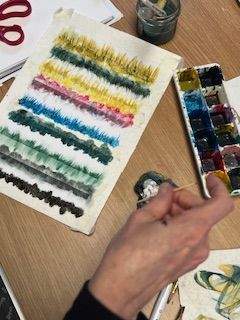
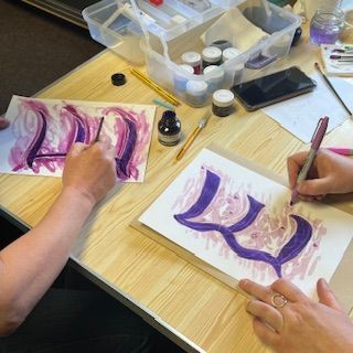
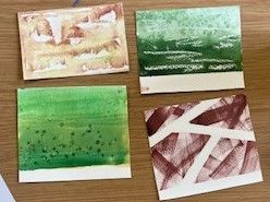
22 | 03 | 2025
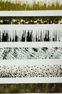
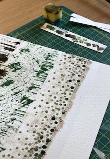
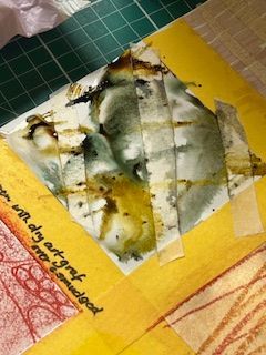
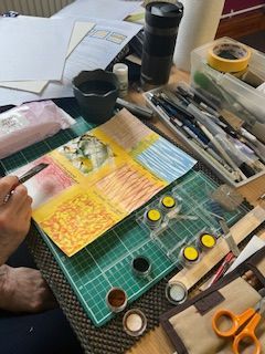
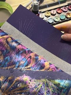
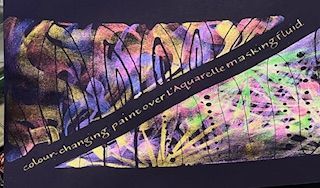
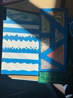
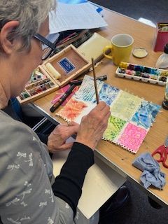
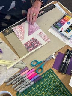
Masking Madness!
Member led - Lesley and Alma
In this workshop we experimented with masking tapes and fluids, resists such as wax candles and crayons, inks, paints and fine lining pens to create interesting backgrounds and patterns. We then explored the possibilities of combining calligraphy and layering lettering to create some very personalised images.
05 | 10 | 2024
Archibald Knox Design
with Josie Brown
An introduction to the lettering and unique mix of Celtic and Art Nouveau style of decoration this Manx designer created. There is a choice of mediums to try out – one giving the unexpected effect of either stained glass or enamelling. An unusual and rewarding workshop.
This is the text area for this paragraph.
To change the text, simply click here and start typing.
08 | 06 | 2024
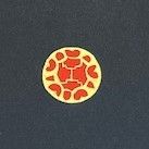
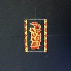
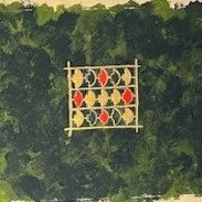
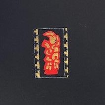
The Staffordshire Hoard
with Linda Lewis
New paragraph
27 | 04 | 2024
Saxon Scripts and Runes Revealed
with Peter Lloyd
A fascinating adventure into historic lettering and translation of mystic symbols to open up new avenues for you to explore.
03 | 2024 Embossing
with Keith Bolton
This embossing workshop was the first of the year and one of our increasingly popular ‘Member-led’ events. It proved to be a highly engaging day and a great start to our year of calligraphic workshops.
12|2023 Folded Star Workshop
Member-led workshop
with Alison Allan and Grace Birt
Pencil Gothic
This workshop took a familiar tool – the pencil – to practice and create gothic letter shapes and use them in combination with a variety of different artistic effects.
The versatility of pencils and their range of “hardnesses” give the calligrapher scope for shading and many different textures, which can take your lettering in different directions.
Soft graphite greys give a subtlety that sometimes the harsh black ink of ‘blackletter’ doesn’t, and the ease of adding some pencil embellishment can re-ignite a love of Gothic.
The Mariner’s Compass
After our very enjoyable Zentangle® workshop last year, Sheila is paying us a return visit.
Following The Zentangle® Method, we will create a piece of art with a maritime influence known as The Mariner’s Compass. During the creative process we will hand draw and use various ‘tangle’ techniques to enhance and decorate our compass design. Our finished piece will be flourished with cardinal pointers to the North, South, East and West. We will also learn more about the history of the Mariner’s Compass and how it has been used for many centuries.
with Alison Allan & Grace Birt
Member-led workshop - Bister Inks and Little Books
Zentangle
Outline

Fun with Finetec
Judith Porch kicked off our 2022 workshop programme with this ‘Fun with Finetec’ workshop which has proved very popular with other calligraphy groups across the UK.
Rustics
Enjoy learning this most elegant of Roman Classical hands and discover that it is not as mysterious as you might have thought.
This is a hand that can be adapted and modernised (if you wish) and is good for developing calligraphic skills.
We will use colour and some basic gilding to achieve some stunning results.

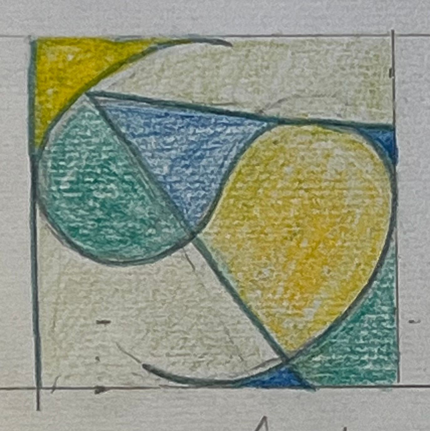
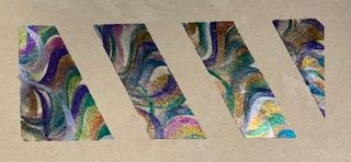
Creative colour for all occasions
Reviewed by Ingrid Eie Bowen
We met in a festive and warm Felindre Welfare Hall. It was a pleasure to meet Jan Pickett who has written the book, “Decorated Lettering”, which is now available in five languages. Some of us were lucky enough to have our book signed. Jan is teaching as far away as Japan.
She started the session with a bit of colour theory, stating there were six primary colours . . . two reds, two yellows and blues. Be careful with colour mixing as two complementary colours make grey.
First we had some fun with pastels and paper masking. Use templates (simple paper shapes) in increasing sizes. You use a sharp knife to get some colour on the templates and rub in hard with cotton wool, keeping the templates fixed. Draw lines or shapes with a hard rubber. No fixative is needed.
Next up was blending coloured pencils. We were advised to use colours that blend well. Colour very lightly and lift pressure from left to right. Use water in the middle and brush up into one colour and then down into the other to mix. When dry, decorate with a black fine liner, more colour, gold, etc.
Colour lift out gave a lovely effect, but was quite time-consuming. We also learnt to write with watery colour using an automatic pen, then adding skeleton letters, infills and variations. Use tracing paper to see if more decoration is needed.
Jan showed us the stained glass effect by colouring and painting either side of pencil lines, then rubbing out the pencil lines when dry. You can tape together two watercolour pencils to draw big letters and then add water to paint the effect.
It was a very useful workshop. Jan gave us lots of good advice, eg, to buy a good sable brush, Winsor and Newton Series 7 was best and size 1 would do for most work. Use 2H pencil for drawing first. Always have good paper – Bockingford advised. Her emphasis was always on having FUN.
Flourishing
Workshop on Flourishes reviewed by Pat Wright
David Simons led a very enjoyable workshop on flourishing. He began by giving everyone a superbly flourished personalised place card that he had created. These cards showed how flourishes could add both beauty and magic to very simple content. Mine is now displayed on a bookcase for all to admire.
In the morning the group the group were introduced to ‘forearm writing’. Several practice exercises encouraged muscle memory for movements based on pivoting the forearm about its mid-point.
We also practiced rotating the pen angle between pull and push strokes and discovered how much we needed to move the paper to keep the hotspot within range.
After lunch we doodled some flourishes and finally added flourishes to words on one of David’s practice sheets where words had been written minus ascenders and descenders.
It was great fun to explore the variety of flourishes possible, heeding David’s advice to choose where the swell came. People were encouraged to be adventurous discovering for themselves what worked and what didn’t. It was a splendid session led by a warm-hearted and very generous tutor.
Monoline Matters
Review by Keith Bolton
We started the session with a control. We wrote out an alphabet of capital letters as we would usually do this, and then hid it away until the end of the workshop.
Margaret supplied us with a workbook, an excerpt from her published book “Creative Lettering”. This equipped us with instruction in the creation of a classical capital alphabet, as well as ideas for future exploration and examples of what might be achieved.
We looked at the Classical Monoline Alphabet and practiced the construction of each letter. We realised there was a lot to (re-)learn. Moving on we studied extended and condensed versions of the classical Monoline hand following the exercises in the workbook. Working carefully we re-established the letters in our memories and moved on to inter-letter and inter-line spacing.
Day one was a busy day.
Day two was project day, an opportunity to play and to colour in. We were reminded throughout the day of the need to keep the basics in mind and look at spaces as we planned the finished project.
At the end of the day we looked back at the alphabet we wrote at the start of day one and could see the progress we had made. Margaret’s workshop proved to be an opportunity to work hard at the basics and to look forward to adventures with letters in the future.
Mouse Roman
It’s fun, it’s lively and it’s contemporary! This workshop was an introduction to a script which is easy to learn for beginners and a light-hearted contrast to other hands for those with some experience.
It can be carried out simply in monoline form or penmanship skills can be developed using press & release techniques. This script is particularly useful for informal and spontaneous work such as greetings cards, journals or little books and anyone can play with the letterforms, enjoying their happy-go-lucky stance on the page.
Review by Joan Mallett
Our first workshop of the year was held at a new venue for us, Llewellyn Hall, Penllegaer.
Josie started by telling us the origins of the Mouse Roman hand. It is an informal version of Roman bookhand based on the Italian Bodoni typeface.
Firstly we looked at and compared various early typefaces and then went on to look at and discuss the skeleton lower case letters which are based on an oval ‘O”.
Our first task was to practice the letters in pencil quickly moving on to writing words so that we gave some consideration to spacing. We continued using pencil to form the letters with their serifs and distinctive ’berries’ on the a, c, r, I, j, and y.
Following a demonstration from Josie we used pointed pen and ink to try and perfect our letters, both in monoline and using pressure and release to add weight.
This is an informal and modern hand and we were soon trying to make our letters bounce by hanging them from a top line, writing with a central line only or using only a bottom guideline which allowed the letters to bounce above it. By trial and error we all discovered our preferred option.
Following lunch Josie showed us examples of her work and how to make a fun Woven Accordion book and tiny concertina books with covers, which I am sure we will all use at some stage.
The hand is relaxed and more effective and bouncy when written quickly so it will be very useful for cards and informal writing. I think everyone enjoyed the workshop and it moved along at a good pace. Thank you to Josie for managing to get to us and for making the day lighthearted, interesting and fulfilling.
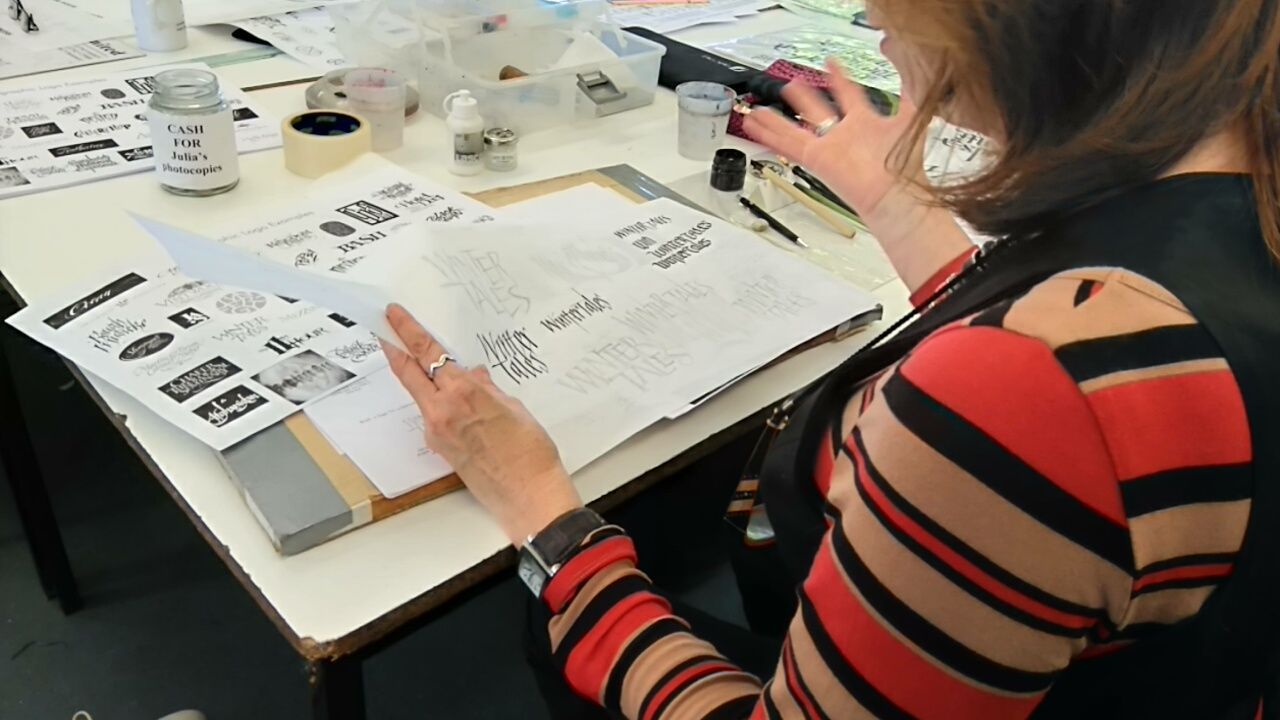
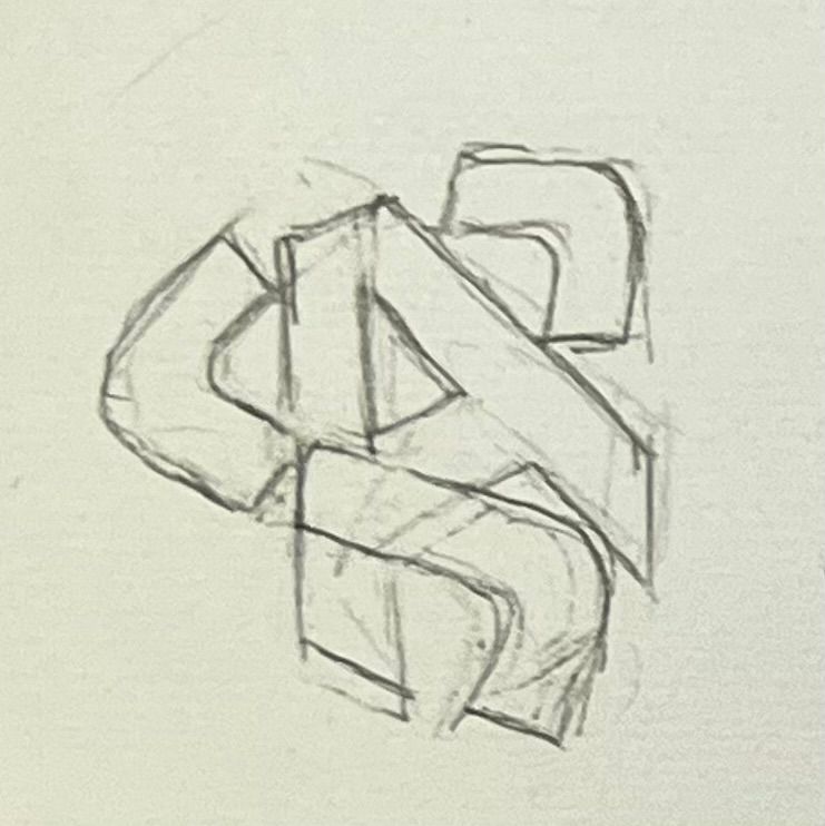
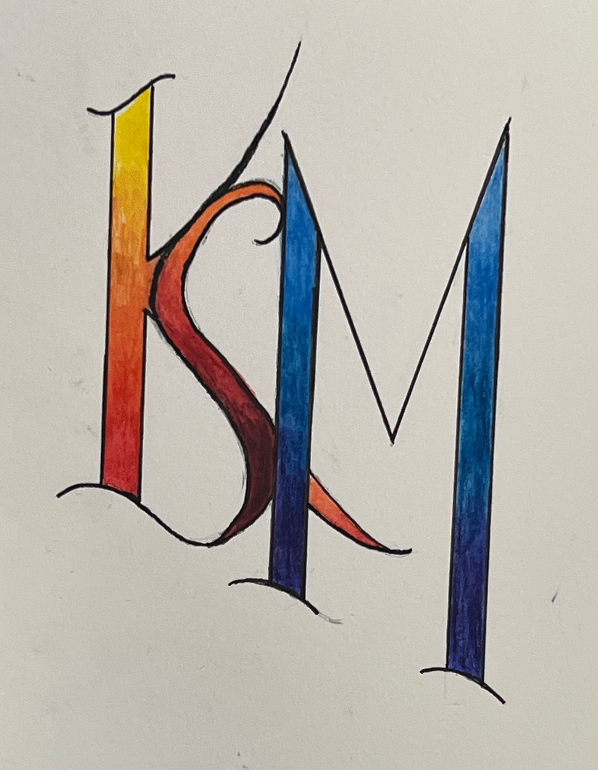
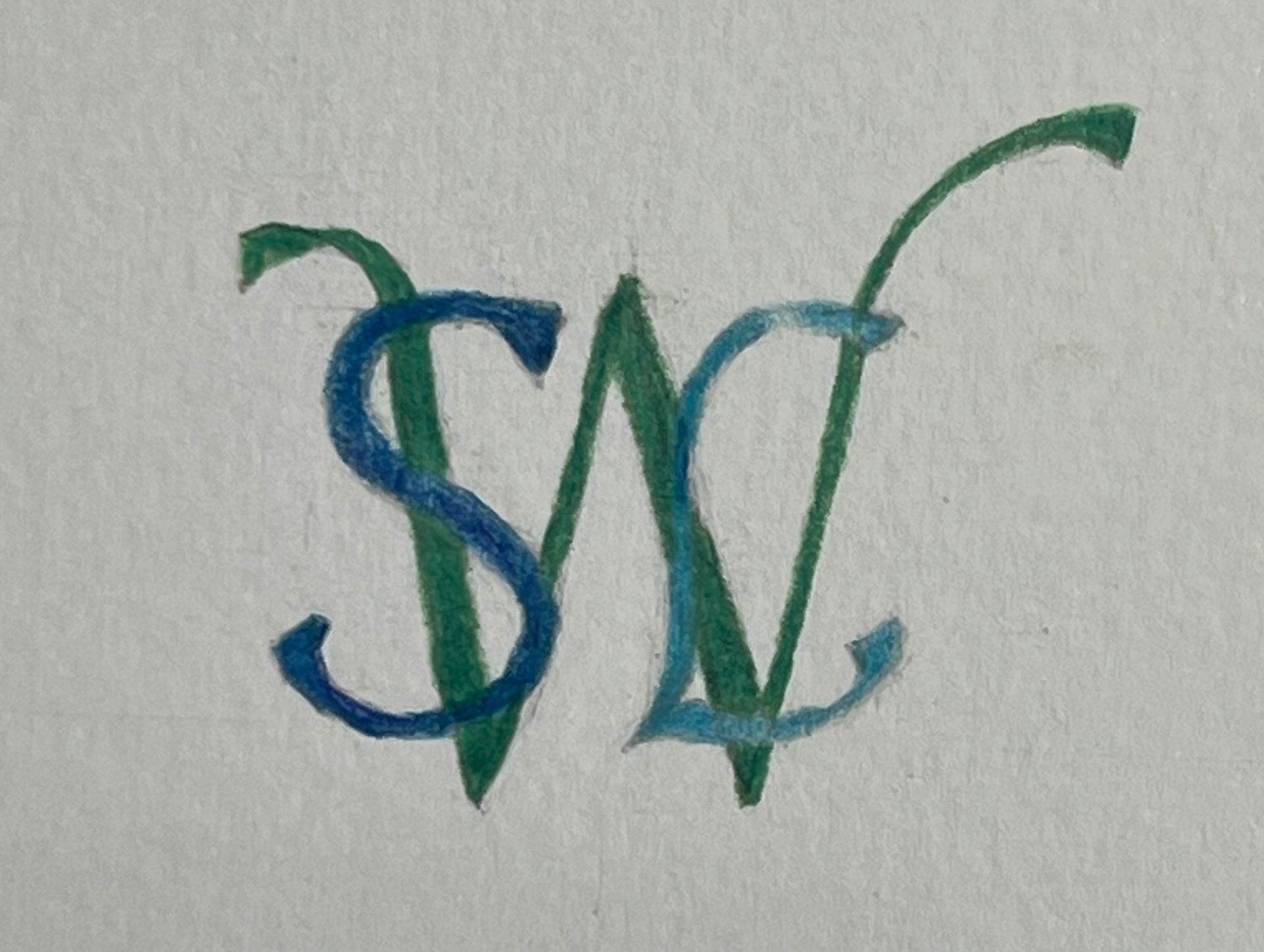
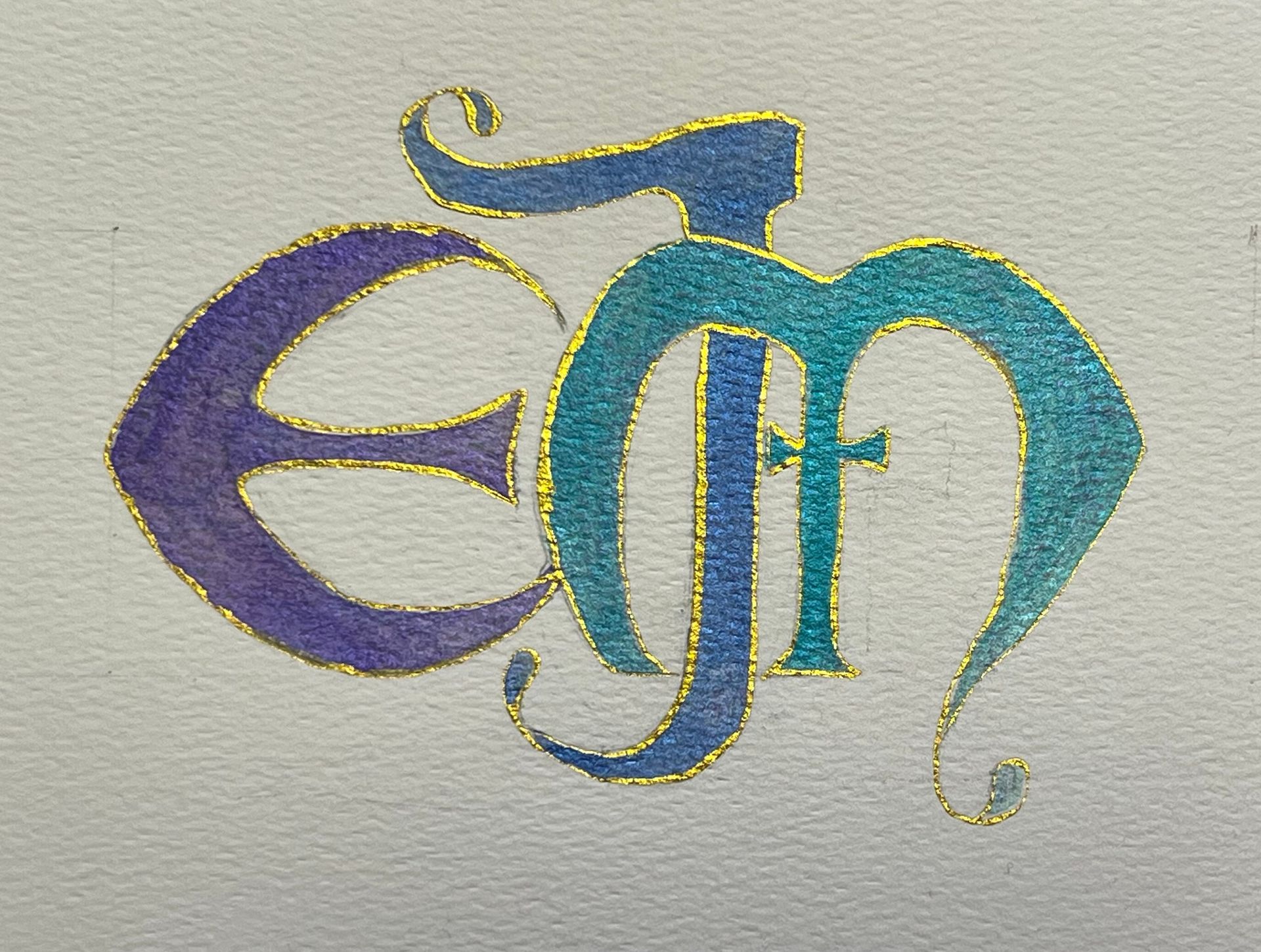
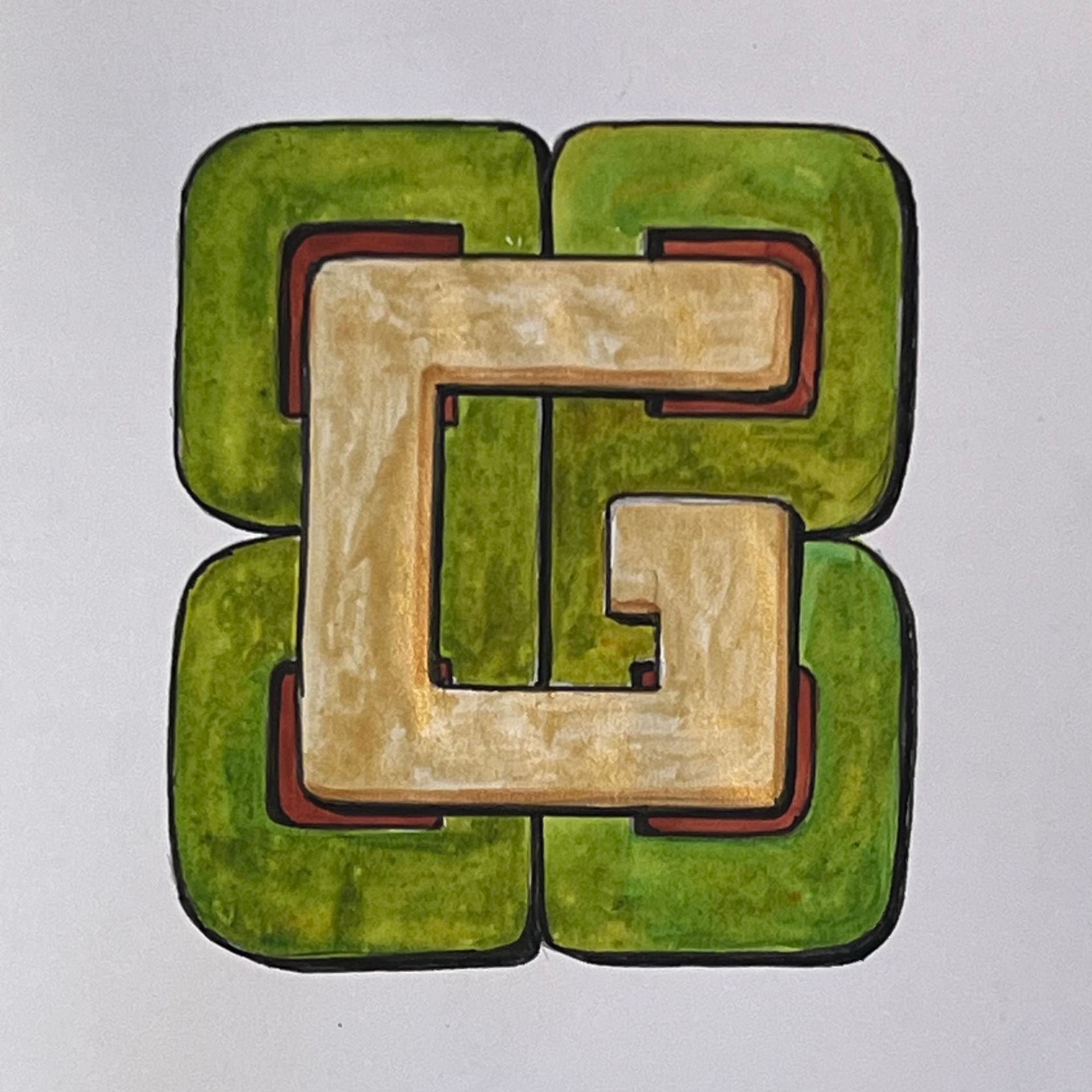
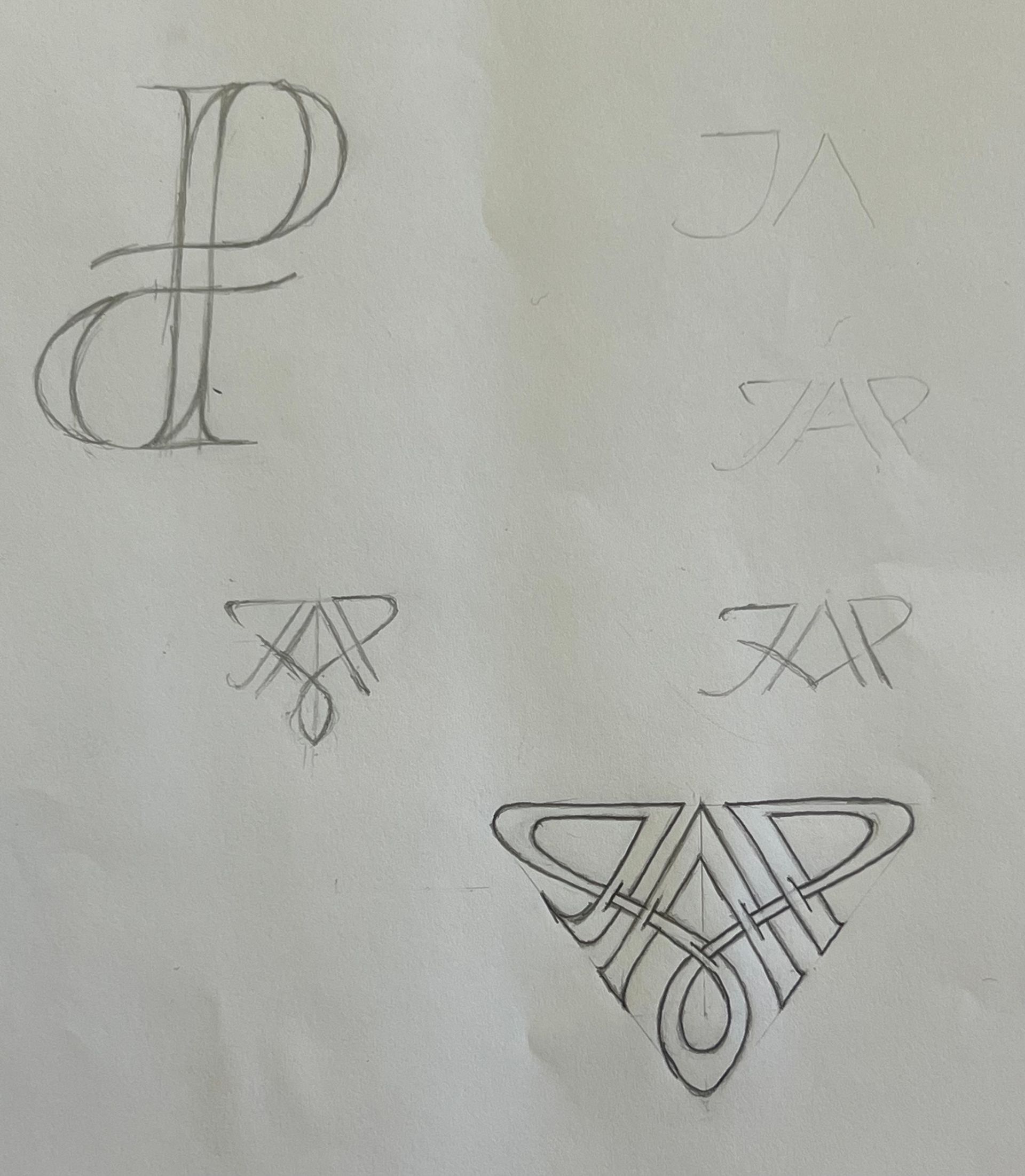
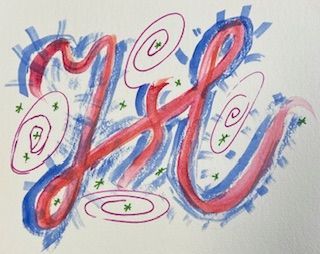
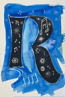
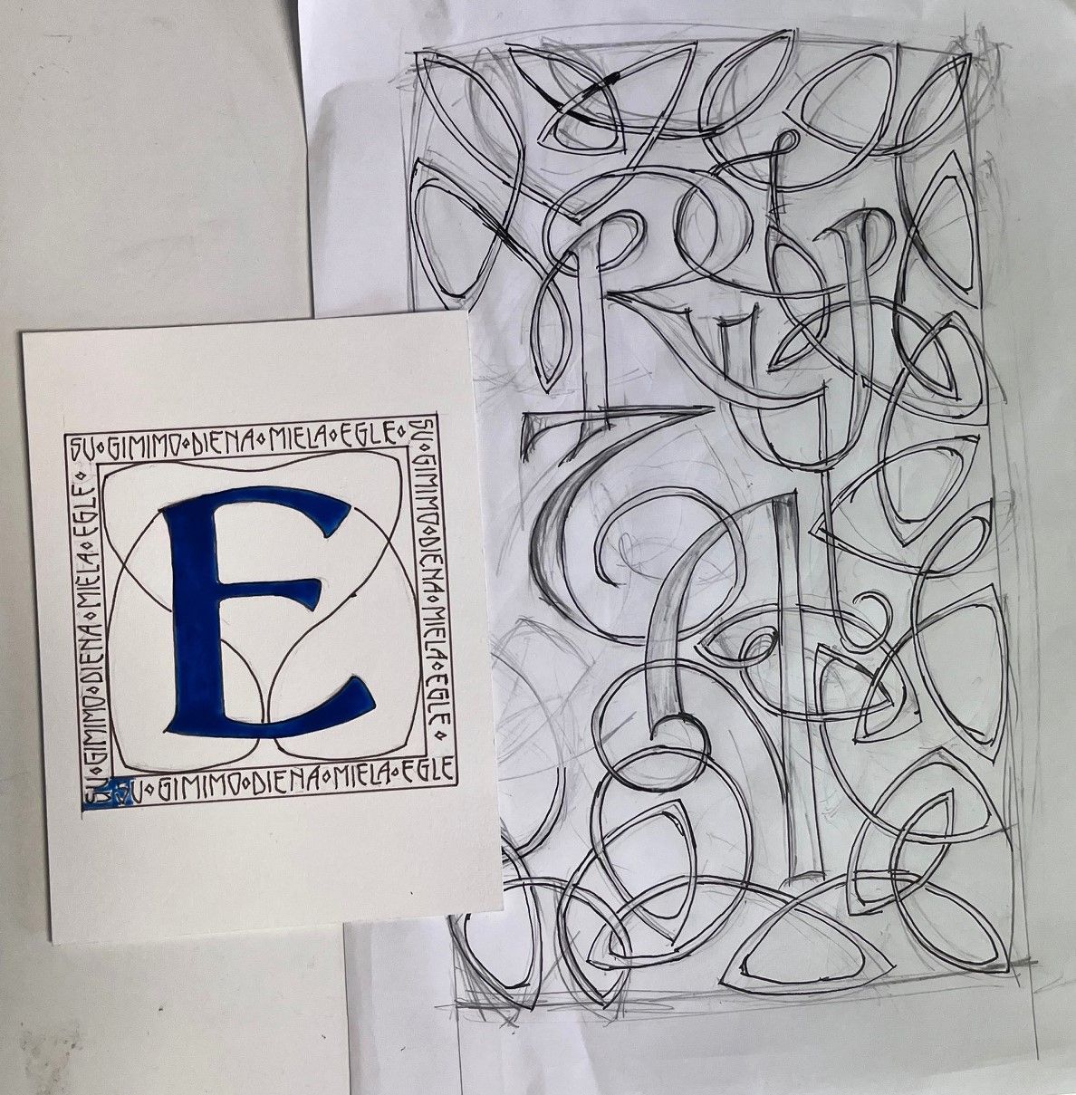
Logos & Monograms
On a sunny September morning we were delighted to extend a warm welsh ‘croeso’ to our speaker Julia Baxter - Ahead of us lay a day learning about how to create calligraphic monograms and logos.
Julia's interest in writing began at primary school. She always had a great love for painting and drawing and studied and gained a BA(Hons) in Graphic Design from Maidstone College of Art, followed by Adult Education classes in Calligraphy and a subsequent an Intermediate Diploma from CLAS. For the past 15 years she has developed and honed her calligraphic skills and now teaches and undertakes private commissions.
Julia's biggest influences are creative contemporaries such as Thomas Ingmire, whose work encourages her to take risks. She especially likes using modern Gothic script based on Textura. This interest was triggered following a workshop she attended by Professor Ewan Clayton on modern Gothic, which alerted her to it's lively and decorative nature. She is equally inspired by the traditional skills of the medieval scribe and examples of highly skilled lettering.
Our morning session was spent developing a monogram - a design consisting of two or more alphabet letters combined or interlaced. Working initially in pencil, Julia demonstrated the step by step process she always follows when producing a monogram. Starting with skeleton letters we learnt how to play with the shape of the letters and determine whether any strokes could be shared, overlapped or juxtaposed. Once a satisfactory combination was achieved thoughts then turned to script style. Reference was made to script exemplars and a pencil template sketch was made of our chosen style. Modifications were made to the weight of strokes, adding curves and plumping the strokes if needed. This sketch was then traced and tweaked and used as a base to develop our final designs in pen and ink. By using repeated tracings and tweakings a final design was made in black gouache, fineliner or marker and tidied up with white gouache. We were provided with excellent handouts which illustrated the stages of the design process and also numerous examples of calligraphic monograms from which to gain inspiration.
The afternoon session covered logos or logotypes which are graphic representations or symbols of a company name, trademark or abbreviation. Many logos are produced by graphic designers using computer fonts but there is often a requirement for logos that capture the individuality of hand lettering .
Following on from the monogram designing we now faced the challenge of playing with more letters to develop a logo. A new logo design is seen as a 'problem to be solved' and the client and calligrapher need to work closely together to have a vision of what is required.
Julia again provided us with handouts illustrating a suggested working order based on actual commissions she had worked on and how the designs were developed. Another handout illustrated a wide range of examples of logo examples. Armed with this information we were provided with a range of logo challenges and briefs and asked to come up with our own designs and interpretations.
Working from a basic pencil sketch of skeleton letters we played with letter shapes, sizes, spacing and flourishes and produced our own interpretations for the logos.
At the end of the session, as is customary at our workshops, our combined efforts were jointly displayed and discussed.
The day was extremely enjoyable and provided us with a fascinating insight into the skills and expertise of professional Graphic Designers.
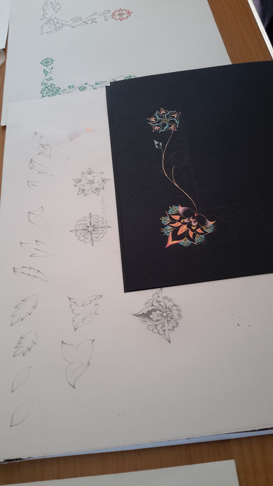
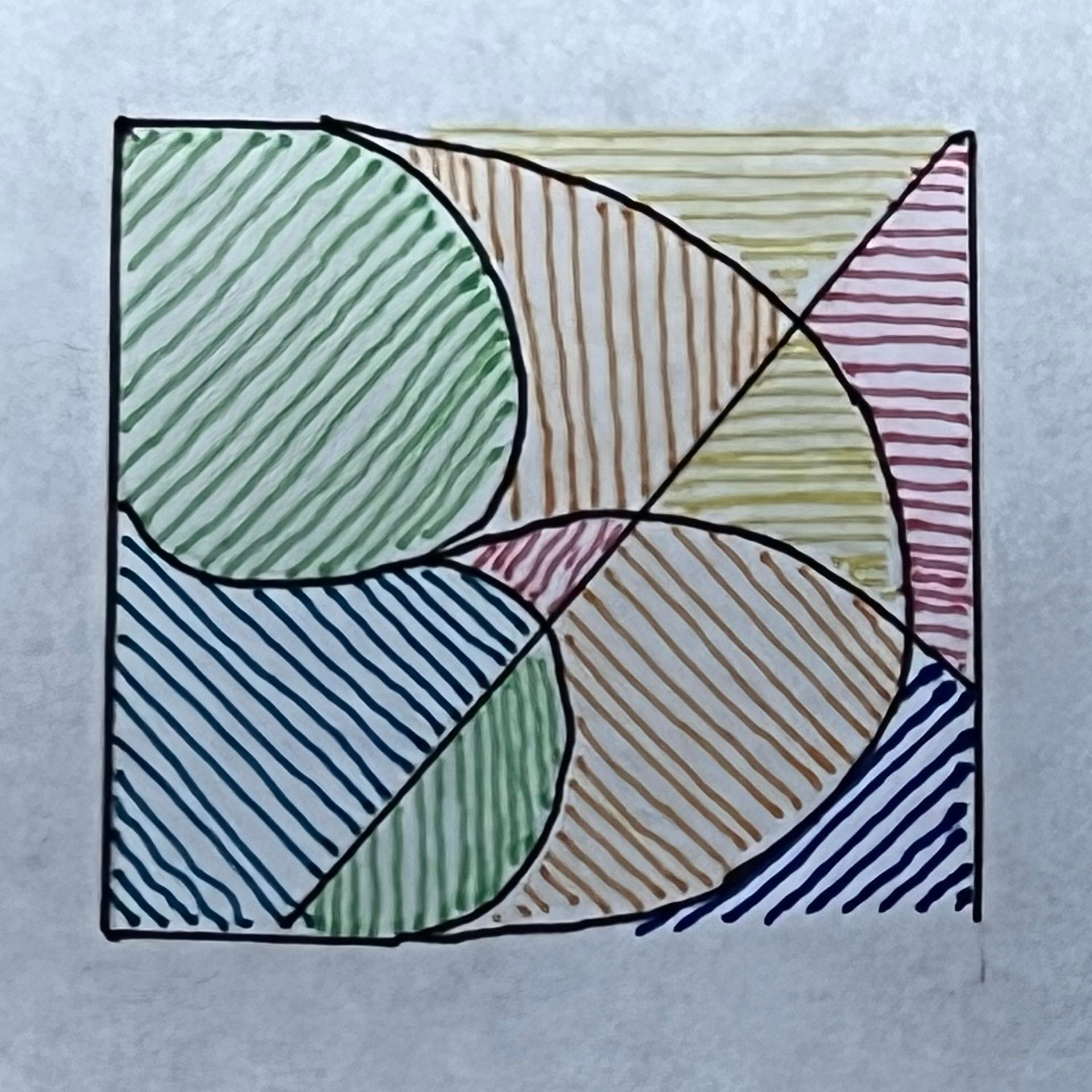
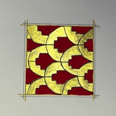
Islimi Biomorphic Design
On a very sunny day South Wales Scribes enjoyed a workshop superbly led by Sylvie Gokulsing who explained that arabesque had nothing to do with ballet and everything to do with designs derived from images found in nature used to create rhythmic, scrolling and interlacing patterns.
For hundreds of years these stylised images have been found not only in illuminated manuscripts and on ceramics, but in buildings, carpets and textiles.
Arabesques made from leaves and flowers are called Hataŷî, so we also learned a little bit of Turkish. These were widely used in Ottoman decoration from the 14th century but they exist in wall paintings from 600 years earlier and probably originated in Chinese Turkistan long before Byzantine artists developed their stylised versions of acanthus. So it was no surprise to find that Hataŷî means ‘from Cathays’ i.e.China’.
To whet our appetite for the exquisite decoration that could be achieved Sylvie had brought along an A3 handmade book of stunningly beautiful Islimi examples, which she had created.
We started the day with 4B pencils and practice paper and the focus was on four basic design elements:
· stylised leaves (Yoprak);
· a flower with varying numbers of petals seen full face (the Penç);
· a half-opened flower seen from the side (the Goncagil);
· a flower seen from the side but with the centre visible (the Hataŷî motif).
Sylvie distributed several examples for each design element and people practised finding that magic combination of the one they most liked and the one they could draw well. She showed how combining these elements could create beautiful borders. Even better was discovering that drawing just one quarter of the design could generate the other three quarters. Indeed such tessalation could be used to fill a page.
Sylvie introduced us to two traditional colouring techniques both involving graduated tones – so monochrome was fine. In Halakar the heaviest colour came at the tip of the leaf/petal, whereas in Mun Hani the darkest areas were at the point of growth. in the latter technique there were usually three tones and the internal shapes were outlined.
The day ended with the class exhibiting an impressive variety of skilfully executed Islimi arabesques.
All in all a highly stimulating, challenging and enjoyable day. Our warm appreciation to Sylvie for so brilliantly capturing the essence of Islimi in a gently flowing, carefully structured and delightfully balanced workshop.
Pat Wright
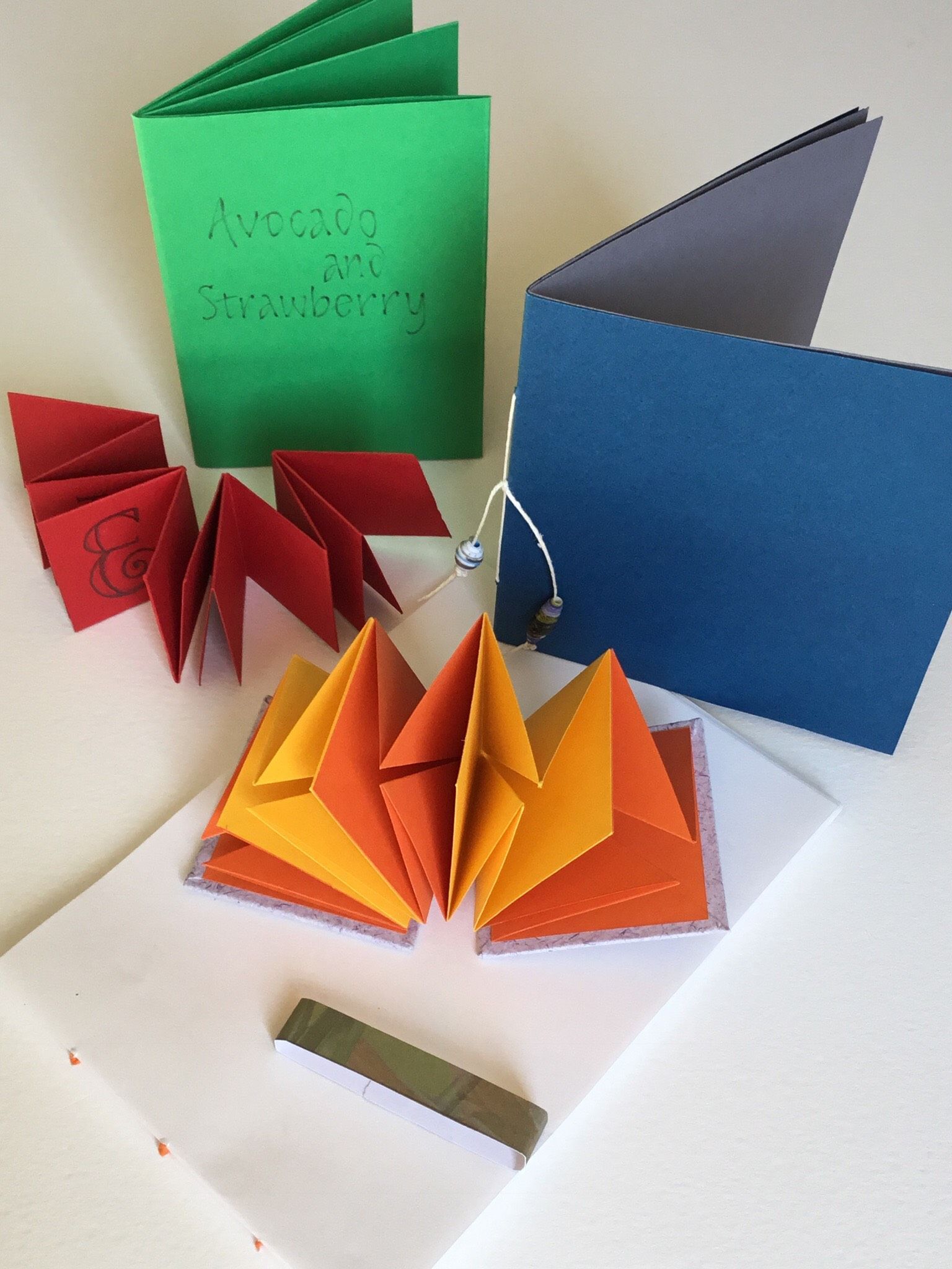
Making Little Books
Janet began by talking about books as a means of displaying our calligraphy. The advantages of books are that they are more tactile than pieces displayed in a frame; they also create a sense of mystery and surprise, and they can be quite personal or equally make a nice gift for someone.
However, because books are handled there are things that need to be considered when using this form, rather than a hung piece, to display our work. We need to think about the form and how it will be viewed, the number of pages, the covers, the fastenings, how it will be stored and kept clean, such as in a box or slip cover. And, unlike a single page display, the direction of the paper grain.
There are a number of basic techniques used in all bookmaking projects and Janet led us carefully through each of what she considered were five essential skills, namely Measuring, Cutting, Folding, Sewing and Gluing, although not necessarily in that order (see Notes and Tips).
In addition to these five skills, an understanding of paper grain is crucial to making a successful book, something that doesn’t concern us if we are producing a flat piece of work. Machine made paper has a grain because of the way it is produced. It is important to consider the direction of the grain when making books (and cards), which should be parallel to the spine so that the pages lie flat. Janet initially had us tearing newsprint to test this out: it tore in a straight line much easier in one direction than the other. We later discovered this was true of folding as well.
During the course of the day we made several different little books, each demonstrating and reinforcing one of the five techniques, although obviously there was some overlap when more than one of the skills were required to complete a project.
Most of us had, at one time or another, made the kinds of books we were making in this workshop but what made it particularly special and helpful were the many and varied little tips Janet gave us along the way, ways of making our work just that little bit more precise.
We were rather pushed for time to get everything finished by the end of the day but we went home with happy faces and a variety of little books to inspire future projects, thanks to the guidance of our excellent, and well prepared, tutor.
Recommended books:
Books, Boxes and Wraps Marilyn Webberley (1995, 2nd edition 2014)
Unique Handmade Books Alisa Golden (2003)
Cover to Cover Shereen LaPlantz (1999)
Ann Sear
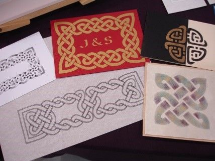
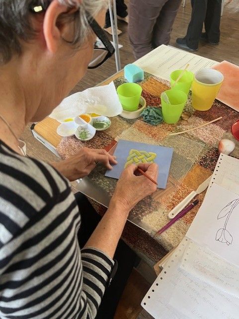
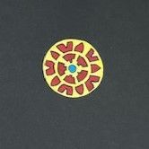
Celtic Knotwork
Come along and learn how to unravel the intricacies of the Celtic Knot and design your own knotwork pattern.
With a few simple rules and a square grid you will discover how to construct the simplest knot and then build on this to make more complicated patterns as the day goes on.
Use these patterns with calligraphy, stone carving, lino cuts, stencils, embroidery, knitting, etc, or just on their own as a beautiful design.
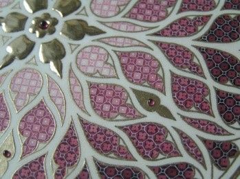
Exploring Diaper Patterns
The workshop is an opportunity for students to learn the methods of creating a diaper pattern, a characteristic decorative feature of many medieval manuscripts.
Rather than produce one 'finished' piece, students will experiment with different 'variations on a theme', exploring the possibilities, which can then be worked up into a piece at home.
Beyond the Literal Letter
Once one masters the ductus and has a thorough understanding of the structure of letterforms, we need to make them our own.
This class will explore ways of looking at letters in a more abstract way while moving away from the rigidity of writing between two lines. The ultimate goal of this class will be to develop fresh and unique styles based on your own existing style while exploring a variety of tools and techniques.
- Writing common groups of letters, both upper and lowercase in skeletal form.
- Looking at the length, angle and position of each stroke and their relationship to one another and how they can be altered for effect.
- Exploring how far the strokes can be pushed and the extremes of letter design without losing clarity.
- Looking at how they change when weight is added and different tools are used.
- Experimenting with a variety of tools and how they can be used to achieve certain effects.
- Combining tools and techniques with the creative letterforms practiced.
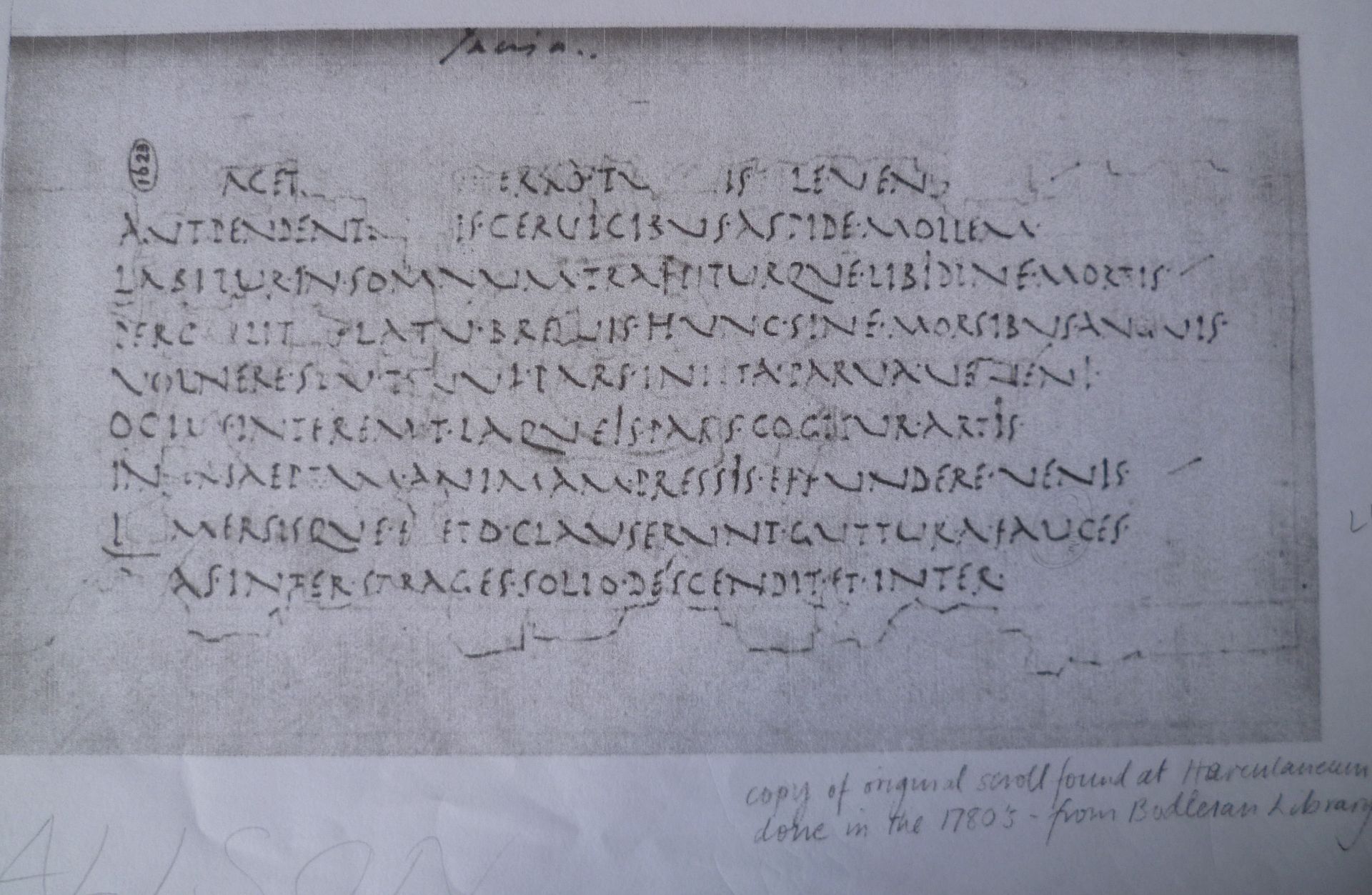
Roman Cursive
This workshop was a day when we got to look in detail at a historical script which is not one which is used quite so often in calligraphy as our more familiar italic, gothic, and uncial. Roman cursive though is the forerunner of the uncial scripts.
The script that Helen was taking as her starting point was derived from an example found on some of the papyri that were discovered at Herculaneum in the Villa of the Papyri in Italy. The papyri were badly damaged in the eruption of Vesuvius in AD 79 and the hand we were looking at came from a just a scrap that had been copied by hand at the end of the eighteenth century and preserved in the Bodleian Library.
Roman cursive is a majuscule script. We started by looking closely at the historical example, how the letters were formed, with some like the E, R, T being very narrow and others, the N and U particularly, being very wide. The Q was very distinctive, almost looking like a K. Helen pointed out that the practice of putting a between words was something we could have use in our own calligraphy to create texture and pattern. We then had a go at copying parts of the example to make us more aware of how the letters were made, including a 75° pen angle which is not something we do very often.
The next stage was to show us how to start developing our own modern version, with Helen helping us to appreciate the contemporary feel which could be given to one of the earliest alphabets. As well as fascinating demonstrations by Helen, we looked at an exercise Peter Thornton had undertaken to develop his own version. He started with a pencil copy of the original, then an “amended” pencil pressure and release version, followed by pen versions, one a heavier weight and one lighter.
It was then our turn and we spent the rest of the day happily trying out pencil, pen and pointed brush versions. What I found fascinating was to watch how carefully Helen worked and how she talked about the importance of this. She said this was particularly true when working with a fine paint brush and that it was worth practising generally with the brush to get skilled and develop a steady hand. I’d liked to say I went home and dutifully practised but ...
Review by Alison Allan
Secrets of Spencerian
‘After studying Mechanical Engineering, I began teaching myself Spencerian and Round Hand after coming across the IAMPETH website around 5 years ago. At first it was a real challenge to learn how to use the pointed pen and to familiarize myself with the movements and pen, ink and paper combinations.
I have now developed a new modern style inspired by nature and the cosmos, based on the historical Spencerian and Round Hand scripts into an (hopefully) exciting new pointed pen “look”.
I think it is important to try to push the boundaries of the art that you are involved in, to try new ways of doing things and to look at lettering in a slightly different way.’
James gave a comprehensive handout at the beginning of the session and briefly explained development of the hand from English Roundhand to Italic Cursive and Circumflessa developed by Italian Scribes. It was then simplified by American Scribes to become Engrosser’s Script, which was mainly used for formal script, and diplomas and it developed into the Spencerian hand which was used widely in American handwriting.
James explained how his Spencerian Script is an exciting and contemporary development of the letterforms, influenced by his interests in Cosmology, Astrophysics and the polyrhythms heard in ‘Jungle’ metal and dance music, using whole arm movement and rhythm. He frequently holds workshops in Italy and America.
We used oblique penholders, adjustable metal flange preferred, but the ordinary plastic variety was used by most of us and a variety of flexible pointed pen nibs. Iron Gall ink was thought to be the best but Walnut Ink or good flowing black ink is suitable.
Our first exercise was to draw oval shapes in the air using a whole arm movement to develop muscle memory, and then to draw the ovals lightly using pencil onto the paper, drawing ovals on top of each other in a continuous movement. We then progressed to moving the ovals along slightly sideways and then to move the direction of the ovals. We progressed to drawing the ovals with pen and ink. This method develops lightness of touch, freedom of movement and muscle memory.
James then demonstrated the individual strokes used to form each letter and letter group and progressed with demonstrations to show, ascender and descender flourishes, angle of slant, and where and how to add pressure. After practicing the individual letter shapes and groups we started to join the letters together to form words.
Throughout the session James frequently demonstrated wonderful examples of his exquisite lettering. It looked as if his pen hardly touched the paper but his lettering was so delicate, all the thick and think strokes were there together with wonderful flourishes and shading. We concentrated mainly on lower case letters in this session, upper case will be for another visit.
James explained and showed us examples of his contemporary work using colour, shape, ink blots and splatters.
The workshop was taxing for most of us but James was charming and there was lots of laughter, it was a joy to watch him work and demonstrate. Lots more practice required from us I think.
We finished off the session with a group photograph taken outside the hall.
Review by Joan Mallett
Colour: Adolf Bernd
This workshop was about experimenting with colour, particularly granulating colours, using the work of Adolf Bernd as an example.
Adolf Bernd (1909 - 1994) was a commercial artist of some note for much of his life and it was not until he was in his sixties that he was able to develop his love of colour into the art form we see in his letter paintings, around which our workshop was based.
The real appeal of his work lies in his subtle use of colour, form and white space. His palette is more often than not limited to only one or two basic colours but in the combination of these colours he finds a whole new palette. And this is one of the main things we were looking at during the first day.
Working through a series of exercises beginning with the basic principles, we learnt more about colour and its properties. We looked at harmonious and complementary colours and the spectrum of colours produced by the gradual introduction of a primary colour into another primary colour. Penny also gave us lots of tips and techniques about using water colour.
Later in the day we looked at some design elements: ways of dividing up the available space in an interesting way and the use of white space to enhance the design.
The second day we looked at the way Adolph Bernd used letter forms in his work and, by mirroring the shapes within the letter and extending them into the surrounding space, produced a pleasing design. Again starting with some prescribed exercises, we then moved on to producing our own personal interpretations. We first looked at simple letters and various ways in which they might be divided up using colour variations and white space and then moved on to producing a Letter Picture of our own.
It was a really inspiring and enjoyable weekend. It was lovely to have the extra time to explore this topic in greater depth.
Review by Ann Sear
Teeny Weeny Writing
How good is your eyesight? This was the most asked question before the day's workshop, but Mary was very wise - the work got smaller and smaller and we got more and more proficient as the day progressed so there was no need for concern ........ or a magnifying glass!
Having a very sharp 2H pencil and a clear ruler helped to ensure our line widths were accurately drawn. A good sharp nib produced crisp lines and we experimented with both Mitchell and Brause nibs of different sizes. Gum Sandarac helped to give the surface of the paper 'tooth' as did the wonderful 'Conte' pastels that we rubbed in carefully .......the pretty hues setting off our writing really well. Different paints and inks were tested including Iron Gall, Walnut, Indian and Quink before we began the count down.
We started with 4mm ruled lines, then went down to 3mm, then 2mm and some of us were even brave enough to attempt one millimetre before the end of the afternoon. Between these lines we used very attractive capitals that were easy to produce and read even when tiny. Our final exercise was to copy some fifteenth and sixteenth century Italian Renaissance italic hands.
Who needs to go to yoga classes to reach a state of inner calm when you can spend the day focusing on 'teeny weeny' tasks with Mary Noble?
Review by Grace Birt
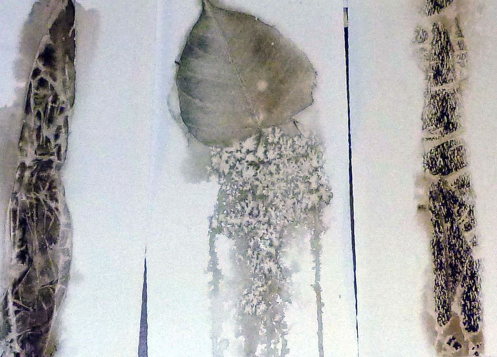
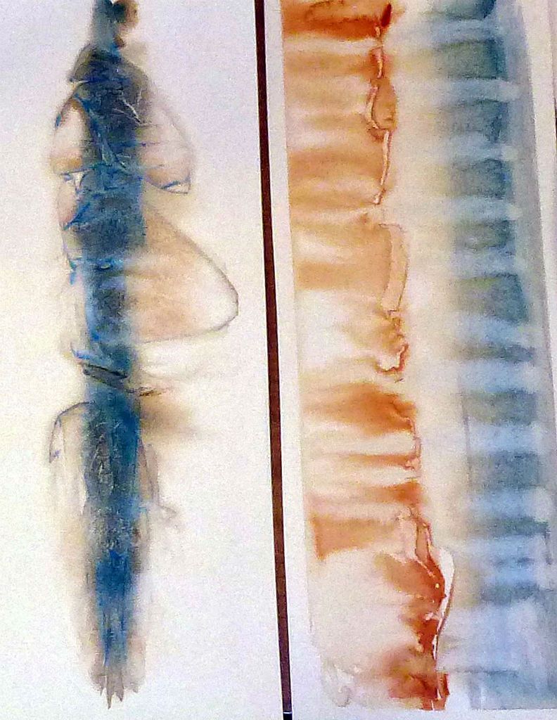
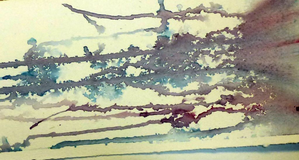
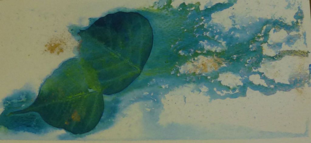
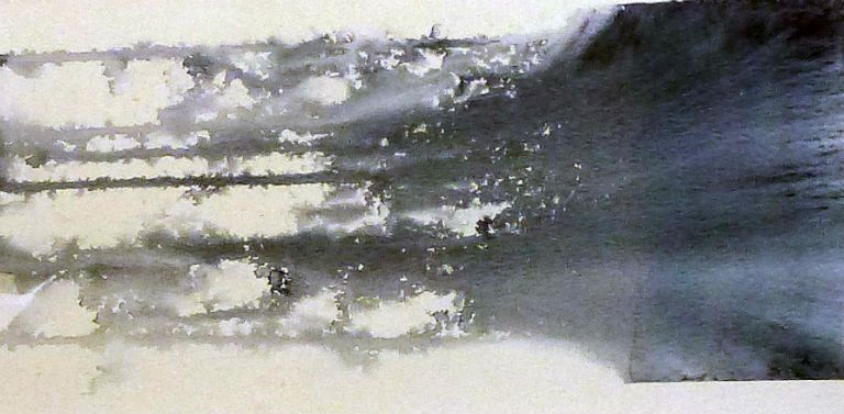
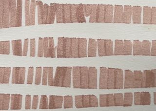
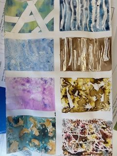
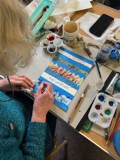
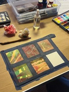
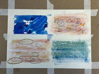
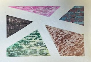
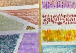
Backgrounds
The committee felt this topic could be very useful for future work particularly with our first SWS exhibition beginning in the next few months. Although at some point we had all prepared backgrounds for pieces of calligraphy we were amazed at the variety and quality we were encouraged to produce by Deborah in one workshop alone. Her ideas and tips knew no bounds.
We began with simple acrylic paint and water backgrounds on cheap and cheerful cartridge paper and these samples could be quickly turned into handy little books.
While paper and inks were drying we made a 'one sheet of paper' book, using this time bold acrylic ink designs overlaid with an acrylic paint wash or 'blue tape' overlaid with acrylic paint and the odd dash of 'Trocol' gold powder for a little bit of 'bling'. All results were very eye-catching and crying out to be written on.
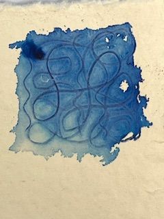
In the afternoon we began our interesting sample books containing eight different pages on good quality water-colour paper:-
• Cling film - wet the paper first then add one or two water-colours down the middle of the page and cover with scrunched cling film before allowing to dry.
• Parchment - paint a line of water-colour down the middle of the page and cover this with torn pieces of baking parchment.
• Leaf - lay a leaf skeleton on wet paper and paint on top with water-colour. Turn the paper and allow the colour to bleed before drying.
• Credit card scene - run a thin line of water-colour straight from the tube down the middle of the wet paper and while wet scrape along this line in small sweeps using the credit card as a spatula.
• Block borders - paint lines of water with a thick brush and add small daubs of water-colour along the base. Use a thin brush to tease the colour as desired as it bleeds.
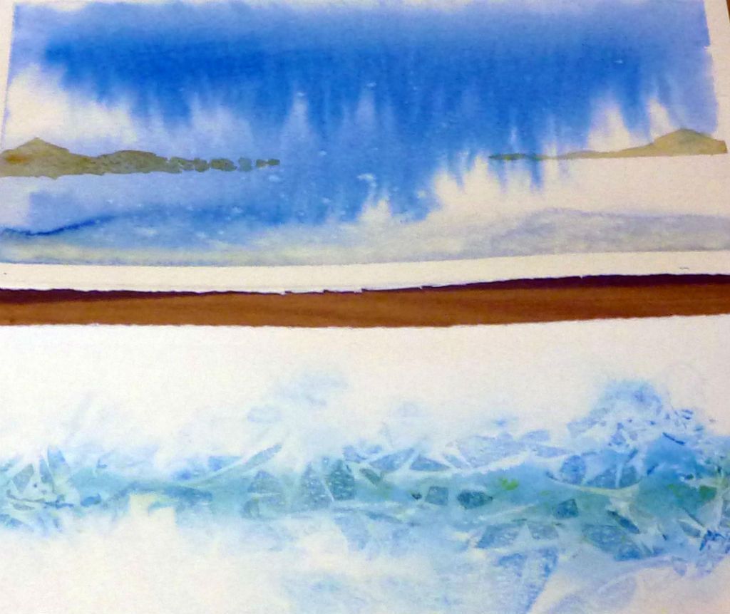
• Horizons - paint a dark 'Z' of water-colour on wet paper and tilt the page to allow bleeding in an interesting design. When dry lay blue tape two thirds of the way down the view and paint in a dark uneven line. After drying remove the tape to reveal land/islands on the horizon.
• Dribbles - paint a block of water and colour at the top of the dry paper and tilt to allow it to puddle at the bottom. Spray with water so the colour trickles in interesting little rivulets.
• Jewels - Spray the paper lightly while holding it upright before laying it flat and delicately daubing the tiny globules of water with colours of choice.
The speediest of us managed to glue these sheets to make a concertina folded paper with a small cover secured the spine to finish off a very attractive little book.
It was certainly a busy day at the end of which we had a wonderful collection of backgrounds to act as a springboard for so many different types of calligraphic work.